20.53. DD 53: Wallet UI Design#
20.53.1. Summary#
This document proposes designs wallet UI. It defines what Android, iOS and WebExtension should follow in order to have a coherent UI between platforms.
20.53.2. Motivation#
We want user to be able to help each others independent of the implementation they are using. We want user to be able to capitalize the effort of learning how to use one wallet and be able to use a different one without the need to learn anything new. Currently development of different platform specific implementation are independent and every developer needs to choose the layout, texts and buttons and navigation.
20.53.3. Requirements#
Every screen MUST be defined in a document with the following information:
Identifiable UI screens: every UI should have a unique identifier that will be use for development discussion and bug reports. There should be an option in the application to enable an active rendering of the id.
Description: the reason to be of the screen, should help to define what will be included into, what is going to left for other screens and when and from where should be linked.
The screen MAY also have:
Predefined assets: every implementation should resue the same icons, images, fonts and sounds.
Additionaly the document COULD defined the components of the UI. If one of this properties is defined in the spec the implementation must implement it. The specification should be minimal to achieve the objective in the description.
Info. Spec of information that the user should have access. The type of info could be a field (id and value) or a banner (information and instructions). The spec will help to reuse the text for i18n across apps and defined
Inputs. Spec of information need to provide in current screen. The type of input, range of values and validation should be defined if necessary.
Actions. Spec of buttons and interactable elements that will have a significant change in the current state. It should also mention navigation when applicable.
Layout. Spec position of elements when needed. The spec should be “soft” in a sense that elements should be easy to find following directions like “close to X” or “at the start/end of the screen”.
Issues. Issues we identified that need to be addressed in some implementation(s). This is in particular about inconsistencies and bad design choices made on some platforms.
Adoption. Things that one version does particularly nice that we might want other implementations to adopt.
Screenshots. Should be provided for all wallet implementations and kept up to date, to ensure that they can be used to aid in UI/UX and QA discussions.
Screen should be defined using the most relaxed definition that are good enough to be clear for the user. Platform will use this definition and adapt to the differences on the platform taking advantange of platform API and screen sizes.
When a screen have multiple uses for the same purpose, a substate section should be included with the difference with the main definition.
Part of the screens that are reused shoud also be defined in this document as screen.
- Common definition:
navigation between screens should not happen if the user didn’t take any action
20.53.4. Proposed Solutions#
List of all screens with the defined properties.
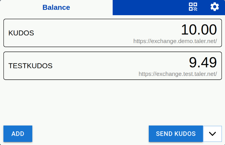
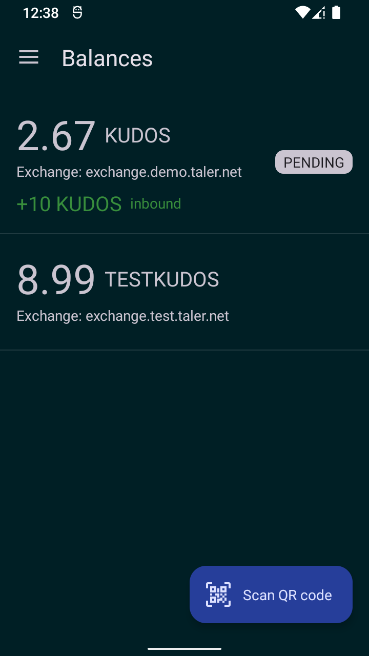
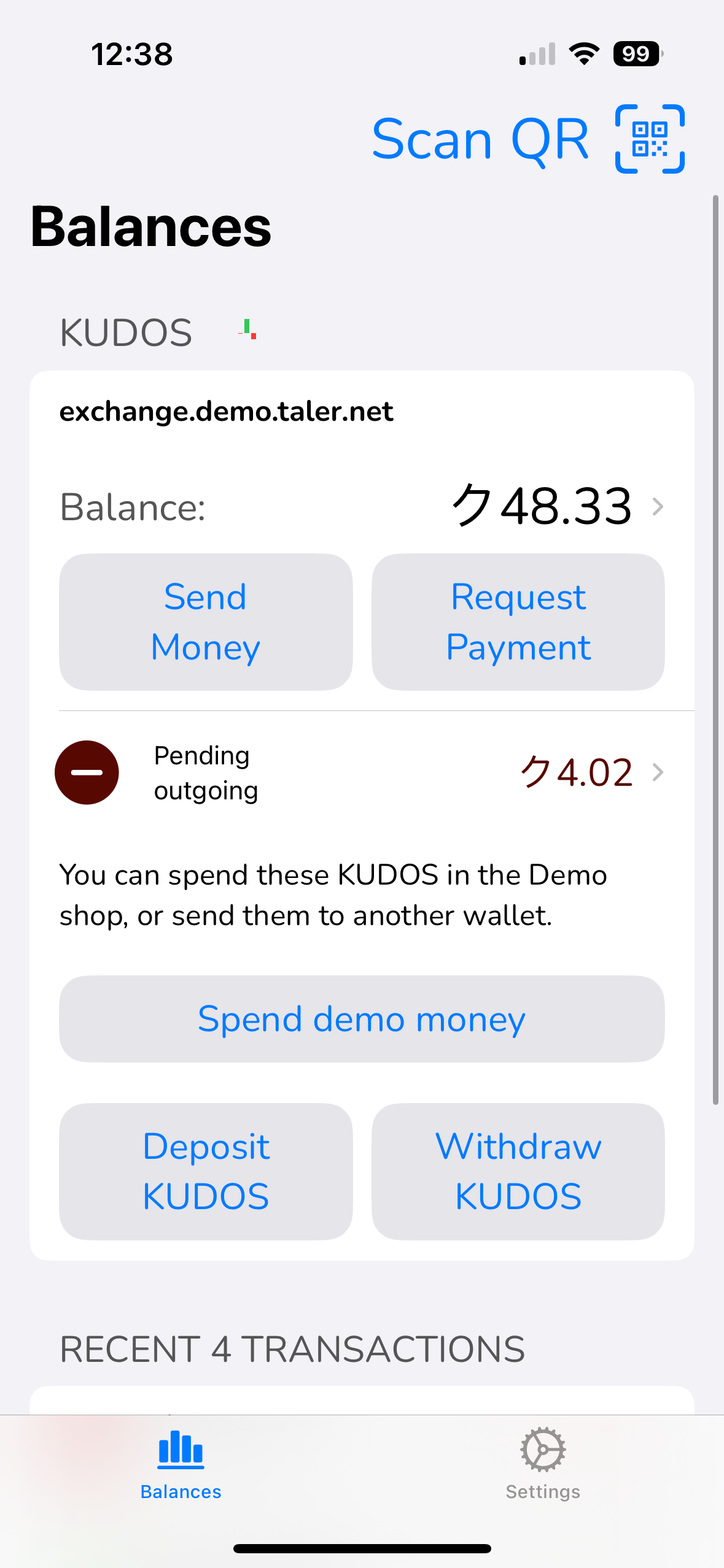
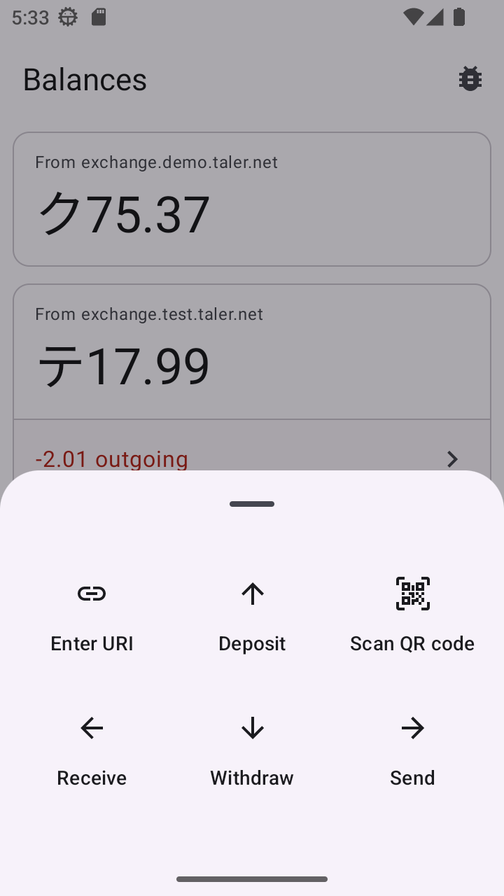
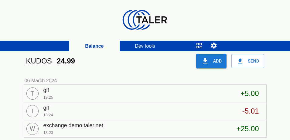
20.53.4.1. balance-list#
This screen shows a currency-scoped list of the balances stored in the wallet, and includes information about the total, incoming, and outgoing amounts, as well as the currency scope information for each item.
20.53.4.1.1. Info#
List of balances in the wallet, where each item contains:
Total amount with currency (see DD 51: Fractional Digits).
Incoming amount (money pending to arrive).
Outgoing amount (money pending to leave).
Currency scope information (see DD 35: Regional currencies).
Strings to use:
Title is “Balances”
“inbound” and “outbound” are used with pending amounts (shown if applicable below the main amount, green for inbound, red for outbound)
“pending” MAY be used as a badge label to indicate that there are pending activities
20.53.4.1.2. Layout#
There SHOULD be a menu or button from where the QR code entry / scan functionality is reachable (cta-url-entry)
There SHOULD be a menu or button from where the settings screen (settings) is reachable, unless settings are handled differently on the platform.
In developer mode, there MAY be a menu or button from where the developer tools (developer-tools) are reachable. Alternatively, developer tools COULD also only be reachable via settings.
20.53.4.1.3. Issues#
WebEx (image): Screenshot does not show any pending transactions.
WebEx (image): Would be nice to include CHF currency
iOS (minor): Remove text “Balance:” within each currency?
iOS (image): Multi-currency screenshot might be nicer
Android (minor): right-align balances?
20.53.4.1.4. Adoption#
iOS: transaction history visualization with red/green bars after currency is nice.
20.53.4.1.5. Actions#
View transactions. Clicking on a balance item should take you to the transaction list (transaction-list) associated with that balance.
View pending. Clicking on the pending transaction amount should take you to the pending transaction list (transactions-pending) associated with that currency.
20.53.4.1.6. Screenshots#
Platform |
Screenshot |
|---|---|
WebEx |
|
Android |
|
iOS |
|
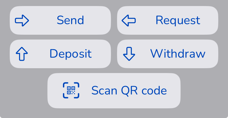
20.53.4.2. cta-actions#
20.53.4.2.1. Actions#
Enter URI:
Deposit:
Scan QR code:
Receive:
Withdraw:
Send:
20.53.4.2.2. Screenshots#
Platform |
Screenshot |
|---|---|
WebEx |
|
Android |
|
iOS |
|
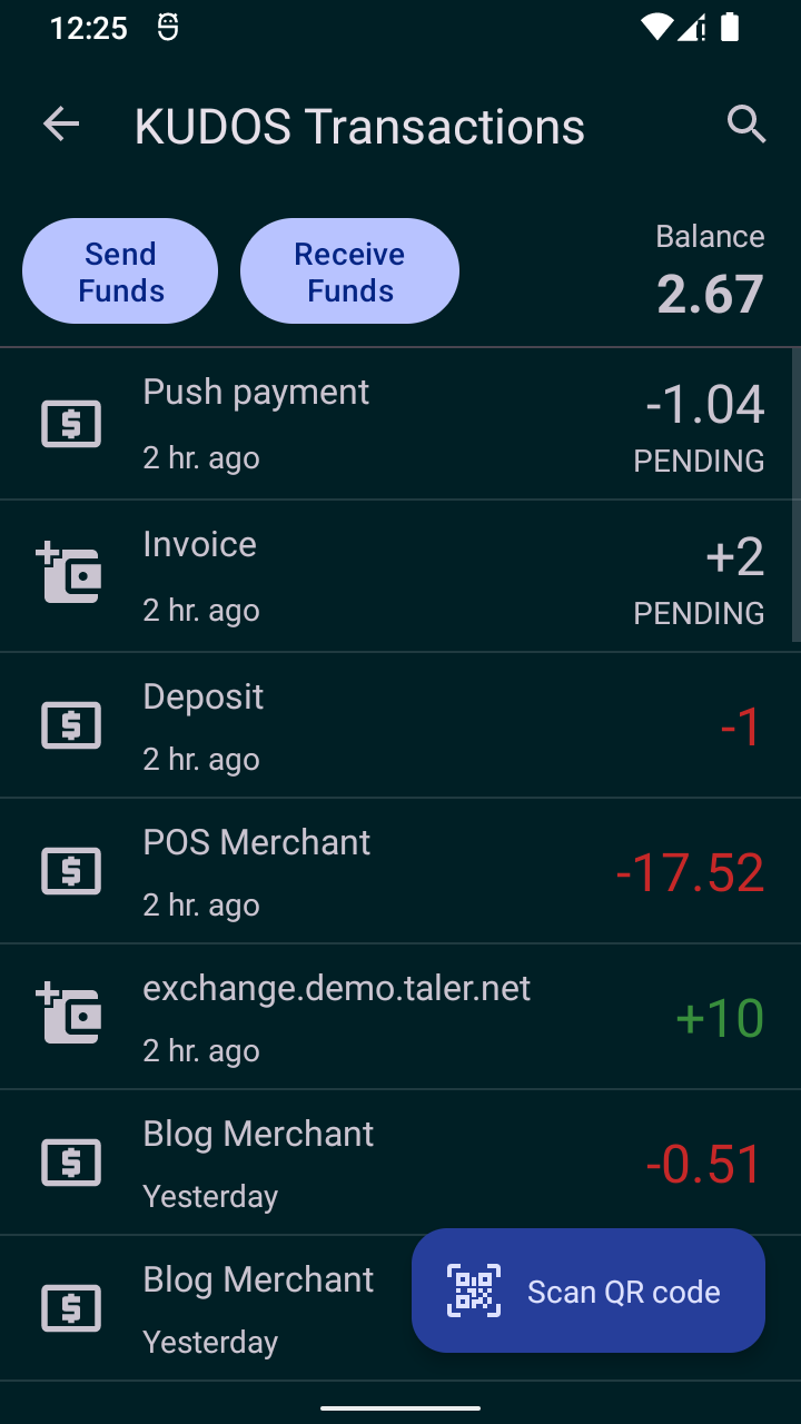
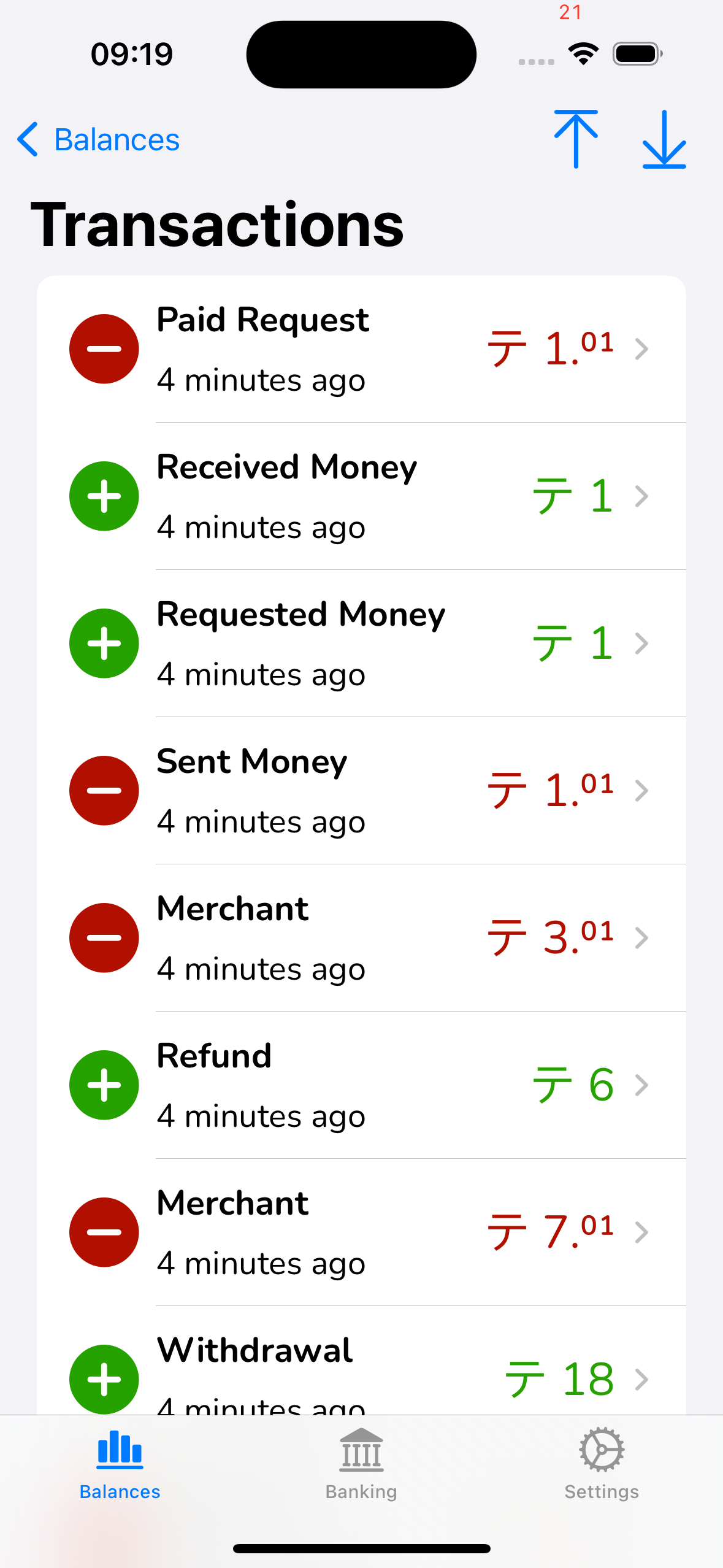
20.53.4.3. transaction-list#
This screen shows a list of all the transactions associated with a given currency scope.
20.53.4.3.1. Info#
Total amount and currency (see DD 51: Fractional Digits).
List of transactions associated with the currency scope, with pending transactions on top, and where each item contains the following:
Title. It depends on the transaction type. It can be the exchange URL (e.g. exchange.demo.taler.net) for withdraw, the receiver name from the payto-URI for deposits, the human-provided summary of the transaction (for push- and pull- P2P payments), the name of the merchant paid (e.g. Essay Shop) for payments to merchants and refunds
Status. It provides complementary information about the transaction for the user, such as the status of the transaction (e.g. “Waiting for confirmation,” “KYC required,” an error message, etc.). (The summary is provided by wallet-core, along with internationalized versions.)
Timestamp. The moment when the transaction was created. Ideally, it should be shown with minimal precision, only showing the minutes, hours or days that have elapsed.
Amount. The positive or negative impact that the transaction has in the total balance of the currency scope. It should be made clear whether the amount of the transaction is positive or negative, ideally with a sign (+/-) and a color (green/red).
Pending. It should be indicated whether the transaction is pending or finished. This can be done with a small badge and with different colors, however, it should be always clear and communicate the message effectively.
20.53.4.3.2. Actions#
Send. The transaction list should include a button that allows the user to initiate transactions that result in money being sent, such as deposits and peer push payments.
Receive. The transaction list should also include a button that allows the user to initiate transactions that result in money being received, such as withdrawals and peer pull payments.
View transaction details. When clicking on a transaction, the user should be taken to its corresponding transaction details depending on the type of the transaction clicked.
Select transaction(s). The user should be able to select one or more transactions to perform specific bulk actions, such as deleting. The interaction that triggers this action might differ across platforms. For example, in Android this would be achieved by double pressing a transaction (to activate selection mode) and then clicking other transactions to be selected. On iOS, this could be achieved using an “Edit” button in the toolbar that reveals checkboxes that allow the user to select the desired transactions.
Delete transaction(s). This could be achieved in bulk via selection mode, or individually for each transaction via a menu or a button. Either way, performing a deletion should always show a confirmation menu before doing the actual deletion.
20.53.4.3.3. Layout#
The specific currency for which transactions are shown SHOULD be prominent (title bar, menu bar)
The current balance should be on top (ideally always on-top) just below the title and on the right of the “send” and “receive” buttons. The current balance should align with the amounts of the various transactions below. If possible, it should have a label “Balance” near (ideally above) it.
There needs to be a way to go “back” to the balance list (balance-list) if we have more than a single currency in use. This can be some (optional) “back” button or some “home” button or some “balances” menu entry.
There should be a menu or button from where the QR code entry / scan functionality is reachable (cta-url-entry)
There COULD be a menu or button from where the settings screen (settings) is reachable. The settings screen MUST be reachable if there is no way to get to the balance list screen because we only have a single currency.
In developer mode, there MAY be a menu or button from where the developer tools (developer-tools) are reachable. Alternatively, developer tools COULD also only be reachable via settings.
20.53.4.3.4. Issues#
WebEx (text): Iconography (T), (W) is not as nice as iconography in on Android.
WebEx (image): Screenshot does not show any pending transactions.
WebEx (image): Title is wrong (not Transactions)
iOS (text): Iconography (+ / -) is also not expressive and redundant with the colors.
iOS (text): Sign of the operation (+ / -) should be just before the amount (see Android), not all the way on the left as an icon. Also can probably be more subtle?
iOS (text): currency symbol in front of every amount value is highly redundant; would be better to list the currency once in the title (see Android)
iOS (minor): lacks search button (see Android)
all (text): use the merchant name for the main transaction label on refunds (and payments to merchants)
all (text): Use the human-provided summary of the P2P payment for both push and pull payments (the direction is clear from +/- on the amount, and it should not matter who initiated!)
all (text): “Deposits” should use the receiver name of the payto-URI of the target account (URL-decoded) in the main title, instead of “Deposit”
iOS (text): “Withdrawal” shown instead of exchange URL for withdraw
iOS (text): “Sent Requested money” shown instead of exchange URL for withdraw
iOS (major): The balance is not shown. The “send” and “receive” buttons are missing.
iOS (minor): has top/buttom scroll buttons not present in other UIs (likely too much, better to have search!)
20.53.4.3.5. Adoption#
20.53.4.3.6. Screenshots#
Platform |
Screenshot |
|---|---|
WebEx |
|
Android |
|
iOS |
|
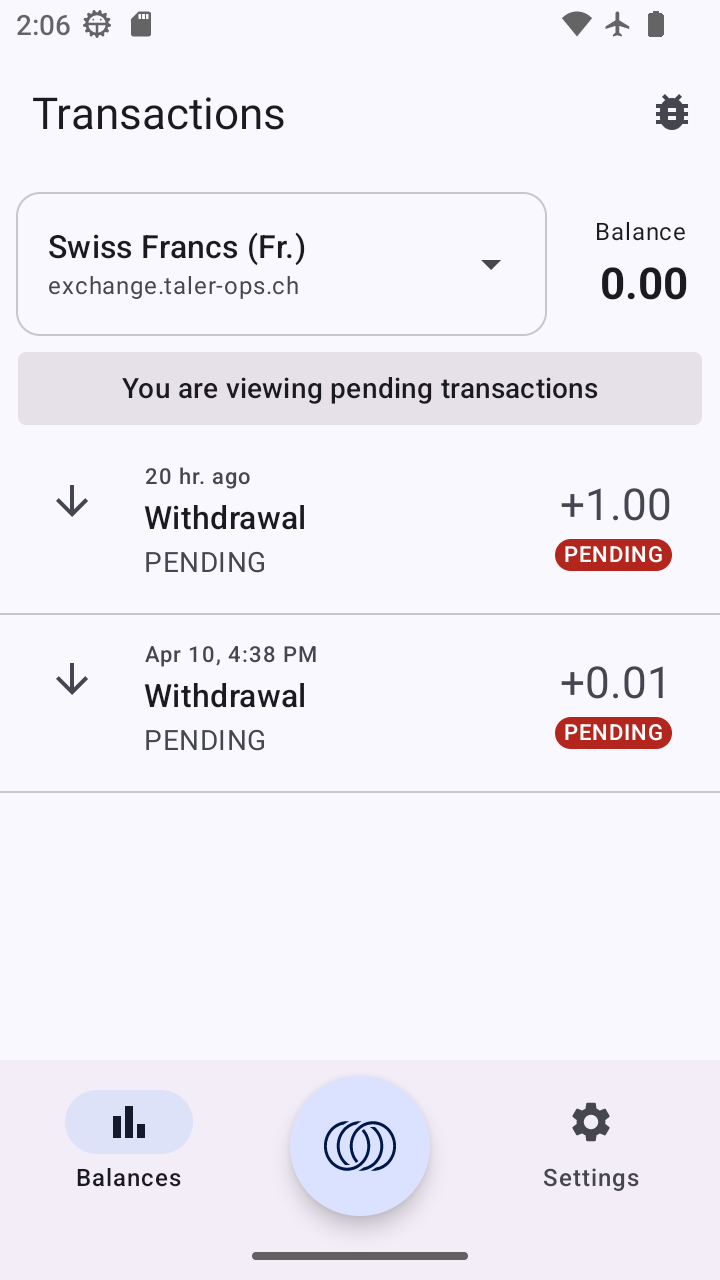
20.53.4.4. transactions-pending#
This screen shows a currency-scoped list of the pending transactions of the wallet for that currency, allowing the user to view details about those pending transactions.
20.53.4.4.1. Info#
List of pending transactions with type/summary, time and amount
20.53.4.4.2. Actions#
Back. Goes to the balances (balance-list)
Select item. Clicking on the pending transaction shows goes to a dialog with details about the transaction (and allows the user to abort it).
See cta-withdraw-pending for the most relevant withdraw-pending screen
20.53.4.4.3. Screenshots#
Platform |
Screenshot |
|---|---|
WebEx |
FIXME |
Android |
|
iOS |
|
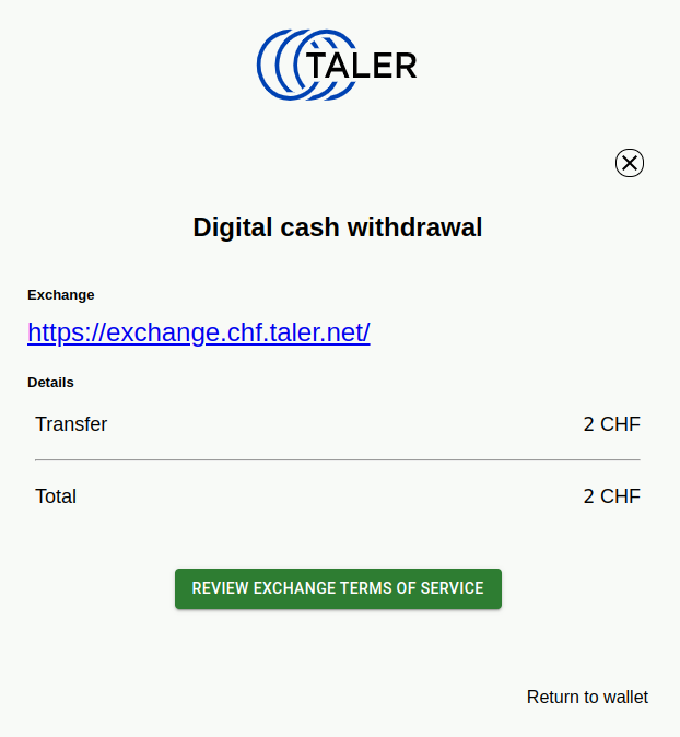
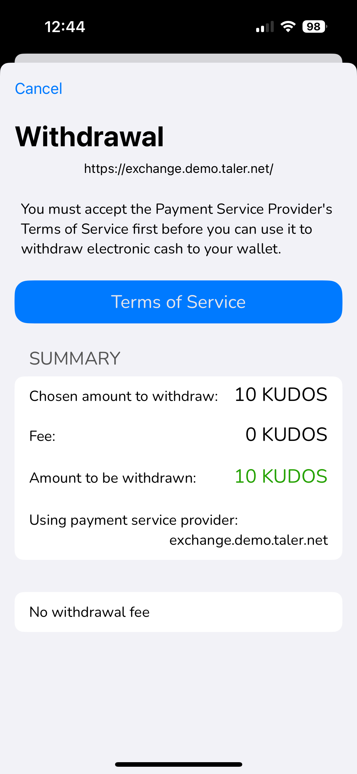
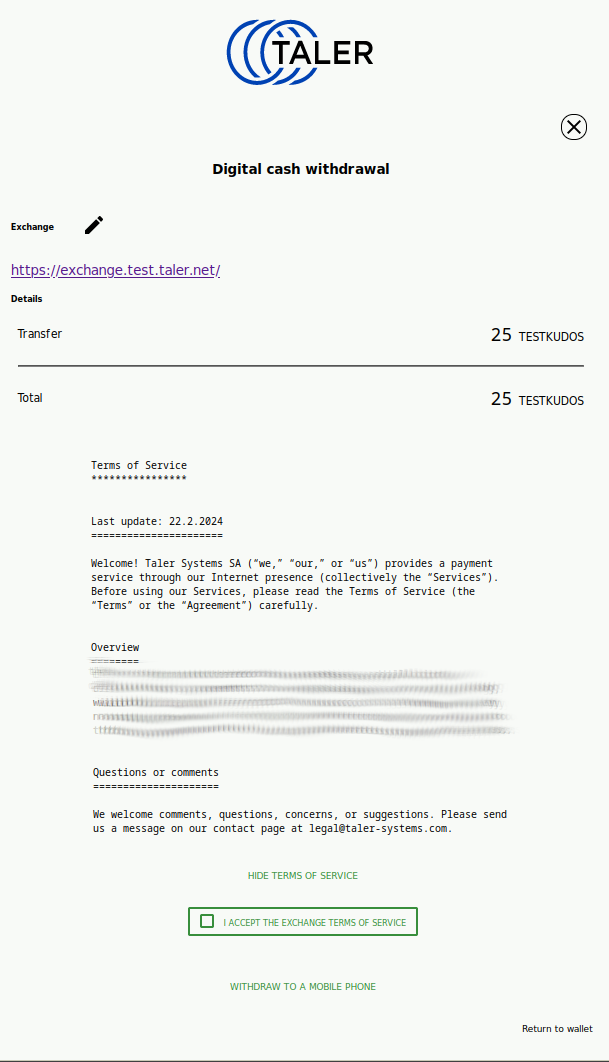
20.53.4.5. cta-withdraw-review#
This screen is used to inform the user that before they can proceed with a withdrawal, they must accept the terms of service of the exchange.
20.53.4.5.1. Info#
Title: “Withdraw $CURRENCY”
Text:
“You must first accept the payment service’s terms of service before you can withdraw digital cash to your wallet.”
Also should show the provider for which we will review the ToS!
20.53.4.5.2. Actions#
change provider: allow user to change exchange provider for withdraw (unless we got the provider in a way that makes is un-editable, say from a cash-acceptor).
review and confirm ToS: advance to the accept-tos screen
back: user will be redirected to previous screen
20.53.4.5.3. Issues#
iOS(minor): Should allow changing the provider on this screen (if allowed)
Android(minor): Only allow changing the provider if allowed
WebEx(major): not unified with other designs
20.53.4.5.4. Screenshots#
Platform |
Screenshot |
|---|---|
WebEx |
|
Android |
|
iOS |
|
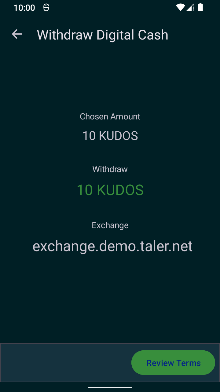
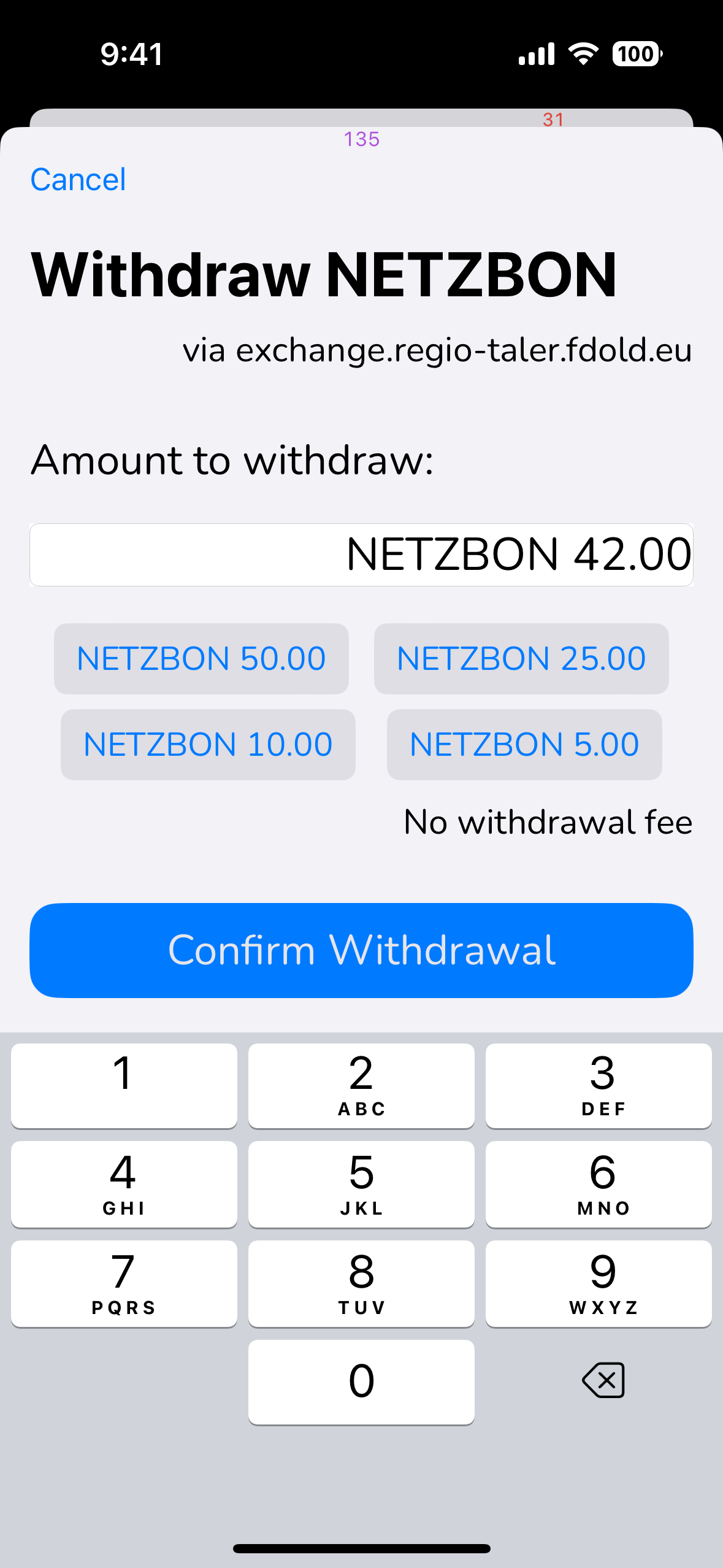
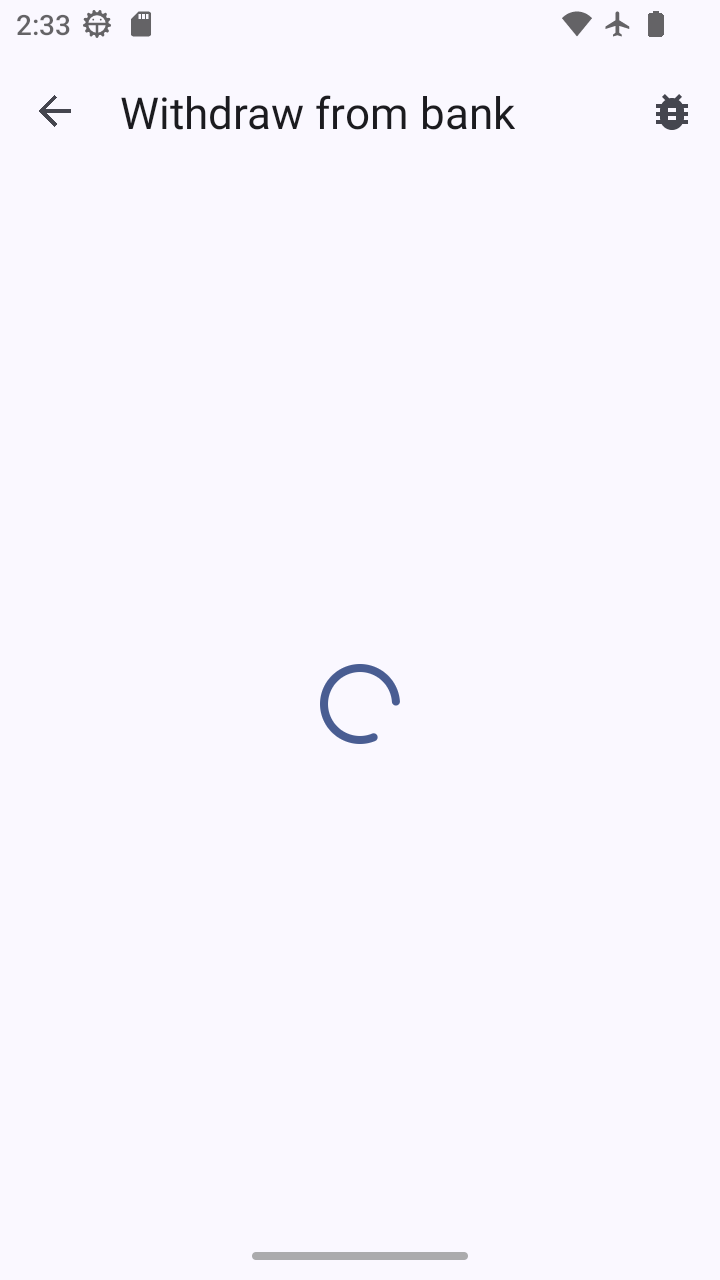
20.53.4.6. cta-withdraw#
This screen is used for the confirmation of a manual withdrawal, bank-integrated witdrawals and exchange withdrawals. the success of this operation will be an increase of the balance in the wallet. Fee, restrictions and ETA should be clear for the user.
There is a related dialog where the currency can still be changed, which then MAY require the “confirm withdraw” button to change into one where ToS need to be accepted first.
20.53.4.6.1. Info#
table of details of the operation: use the operation-table-details screen
starting currency: if the exchange has the currency conversion service enabled user should be able to the details based on the wire transfer currency
service provider to be used showing the URL
amount to be withdrawn
applicable fees (if any)
20.53.4.6.2. Inputs#
age restriction: allow the selection of the restriction in the age group possible by the exchange
service provider: allow the selection of different exchange
20.53.4.6.3. Actions#
CURRENCY NUMBER (optional): hot-buttons for quick entry of common amounts
confirm withdraw: on success will be redirected to the
transaction-detailsscreen where the detail of the current transaction will be displayedback: user will be redirected to
balance
Attention
User should be able to play with the amount, not possible in the current design
20.53.4.6.4. Issues#
WebEx(major): the flow and dialog style here diverges too much from the other platforms (bad).
iOS(minor): title is less clear than “Withdraw from bank” on Android
20.53.4.6.5. Adoption#
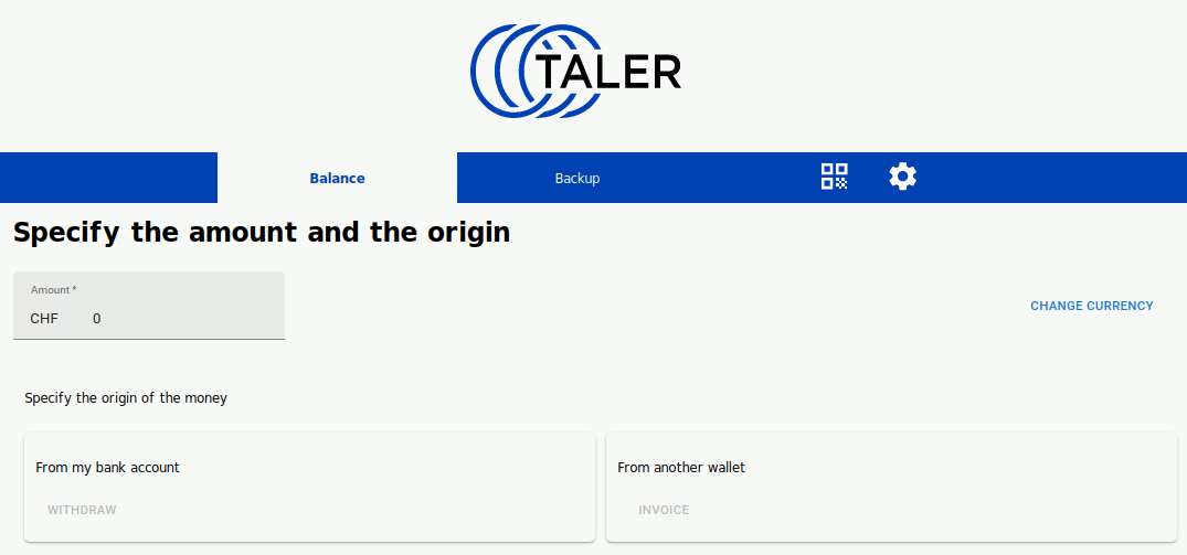
We should probably keep the “specify the origin of the money” from Firefox as a dialog after “Receive funds” is selected in the transaction list (transaction-list), but without the amount entry. Keep it simple, mostly binary choice: withdraw, invoice, or back.
Eventually, we may want an “edit” (pen) icon next to the exchange URL, and if context has fixed the amount or exchange, the respective buttons should be hidden.
20.53.4.6.6. Screenshots#
Platform |
Screenshot |
|---|---|
WebEx |
|
Android |
|
iOS |
|
This screen is used to ask the user to confirm the withdrawal operation, now that all data has been provided.
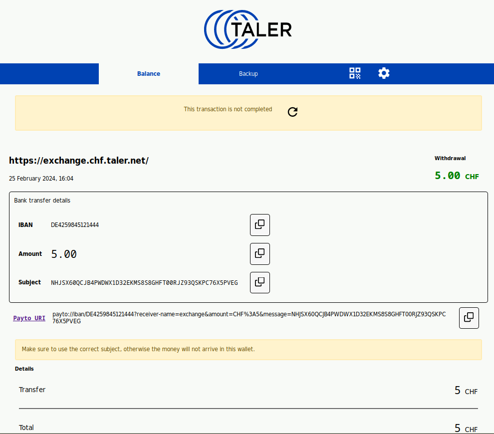
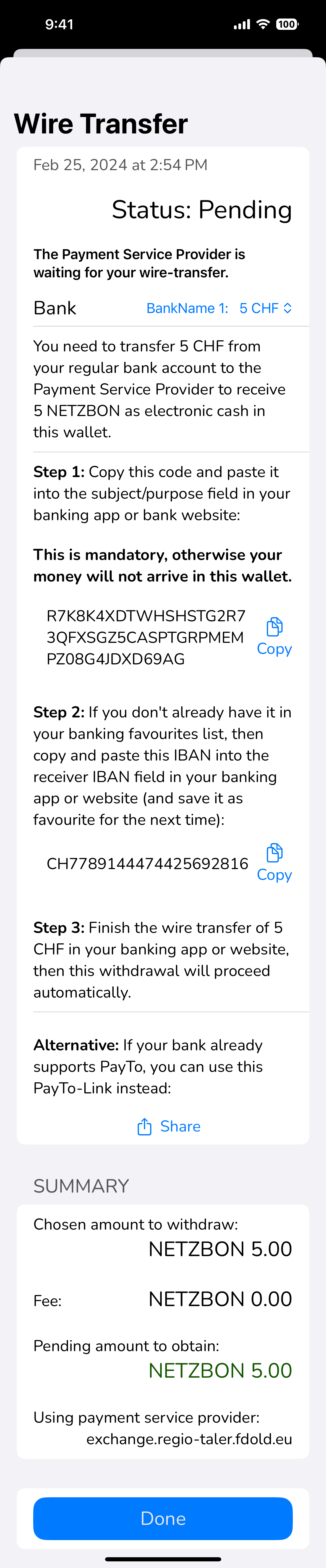
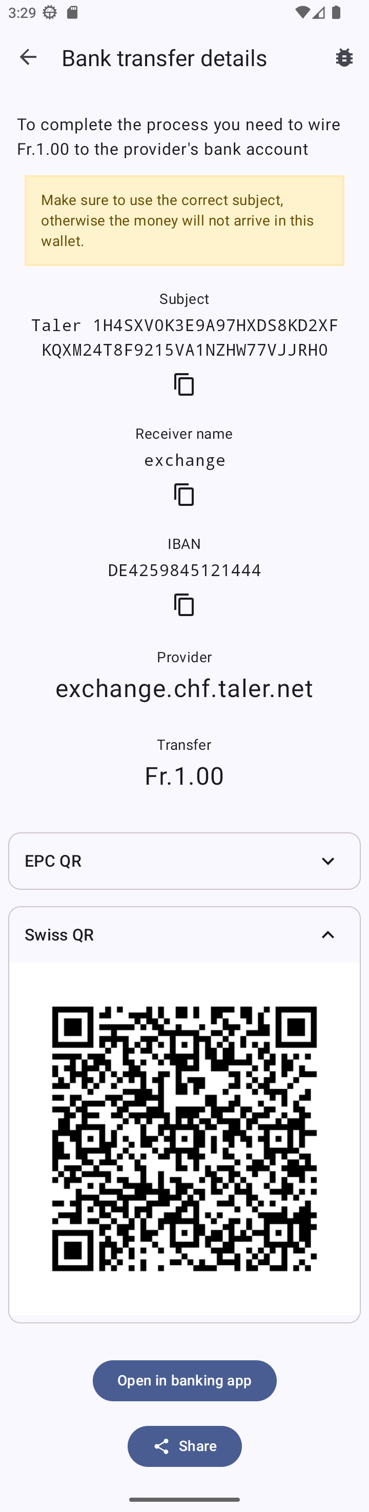
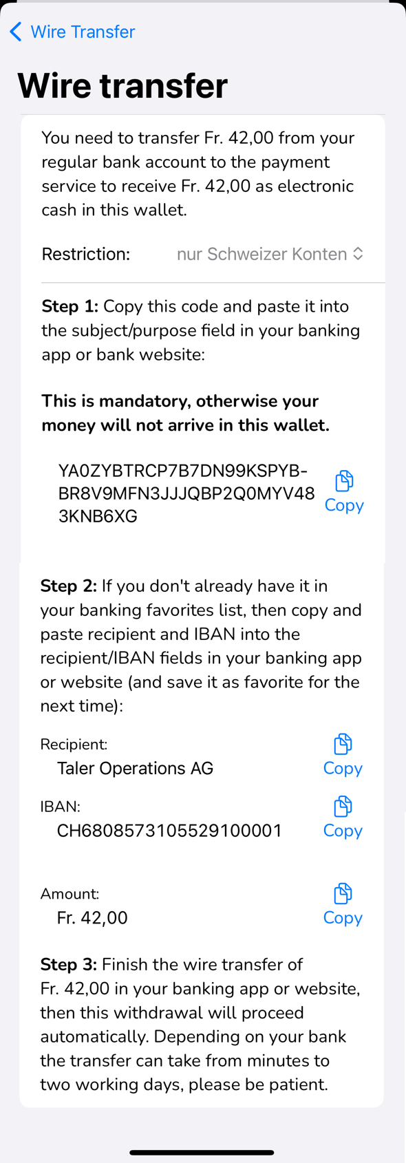
20.53.4.7. cta-wire-transfer#
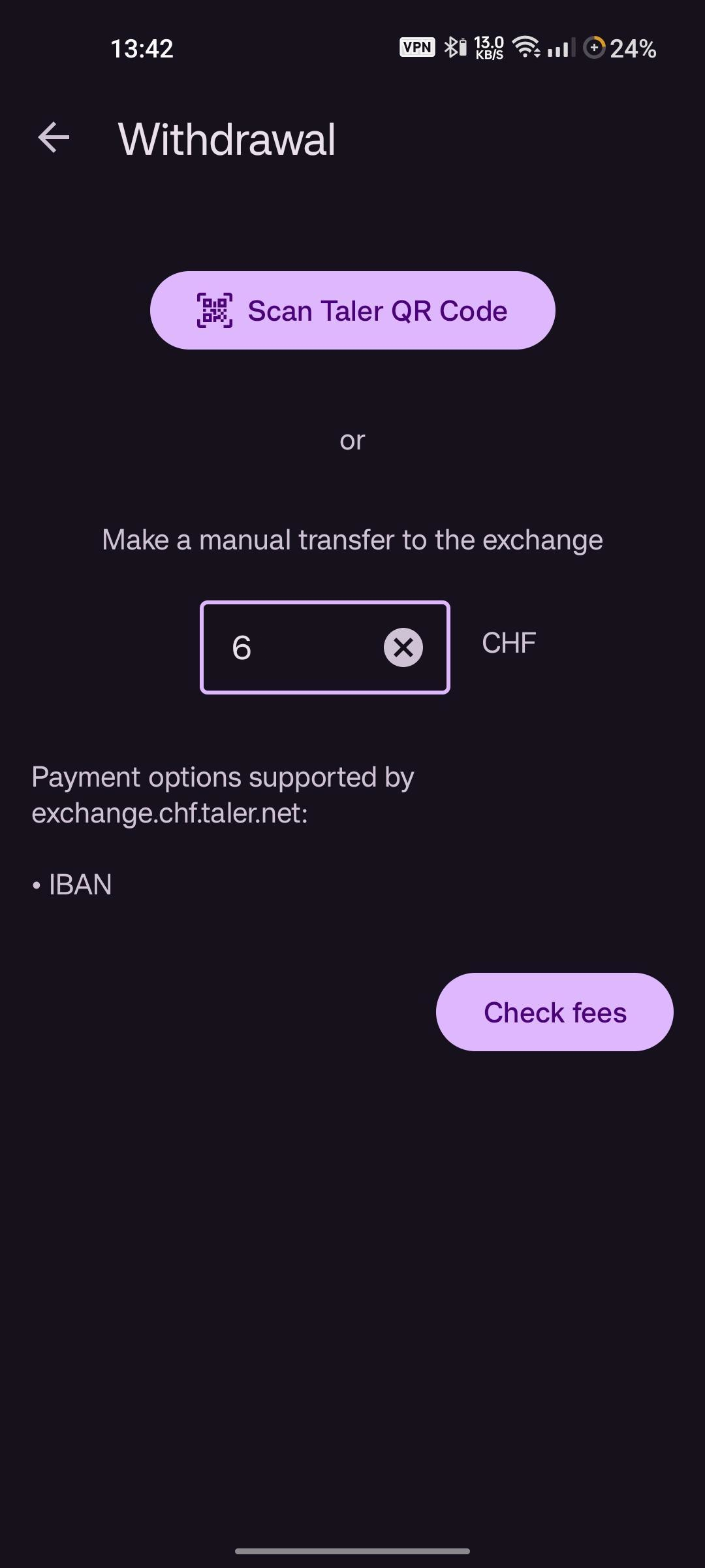
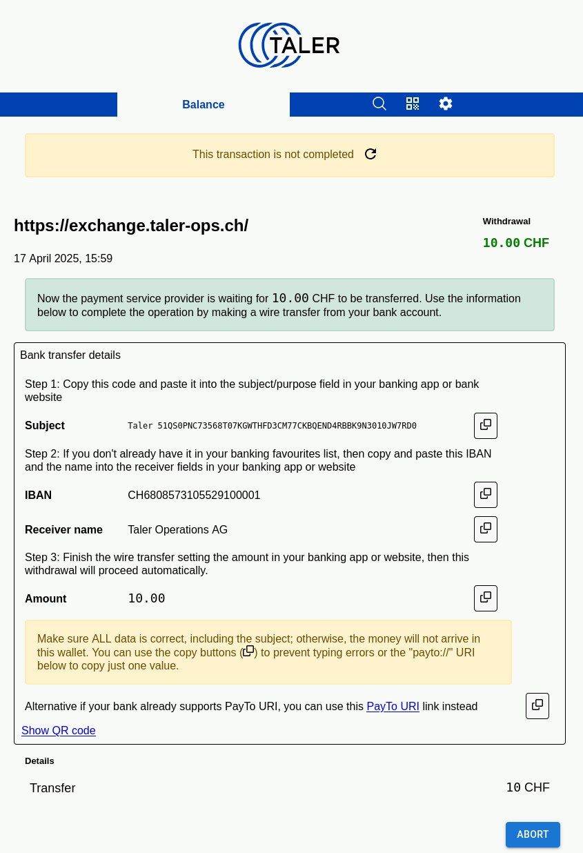
This screen is used to show the user the information for the wire transfer to complete a manual withdrawal operation.
20.53.4.7.1. Info#
wire transfer subject to be used (first, most important)
target bank account to transfer funds to (e.g. IBAN)
total amount to transfer in the wire transfer currency
button to copy
payto://URI with the information to clipboard
20.53.4.7.2. Actions#
done: go back to the main balances list (operation continues in background)
view detailed instructions: go to cta-wire-transfer-details
view QR codes: go to cta-wire-transfer-qr
automatic: screen changes to cta-withdraw-done upon completion
20.53.4.7.3. Issues#
WebEx(text): if there is no fee, no point in showing the amount 3 times. Maybe only show the amount on top with the wire transfer details, and then at the bottom show the fee ONCE if there is one?
iOS(minor): fees are shown even if they are 0; hide!
All(image): the screenshots do not show how to select an alternative bank (see: Netzbon). Might be nice to show that.
20.53.4.7.4. Adoption#
iOS(minor): the way to switch between different banks is not as clear as it was on WebEx. Proposal: use notebook tabs similar to how it is done on WebEx (IIRC?)
Android(text): iOS has much clearer instructions (more text)
iOS(text): transaction status is shown as “pending”, which is kind-of redundant as once we are no longer “pending” the wire transfer details will no longer be shown, so the entire screen will look different. So we can probably get rid of the “Status: Pending” on WebEx/iOS as that is always the case when we give the user wire transfer instructions here!
20.53.4.7.5. Screenshots#
Platform |
Screenshot |
|---|---|
WebEx |
|
Android |
|
iOS |
|
20.53.4.8. cta-wire-transfer-details#
This screen shows the detailed instructions for the manual wire transfer.
20.53.4.8.1. Info#
wire transfer subject to be used (first, most important)
target bank account to transfer funds to (e.g. IBAN)
total amount to transfer in the wire transfer currency
button to copy
payto://URI with the information to clipboard
20.53.4.8.2. Actions#
back: goes back to the main wire transfer screen
copy: copies details about the instructions to the clipboard
Platform |
Screenshot |
|---|---|
WebEx |
FIXME |
Android |
|
iOS |
|
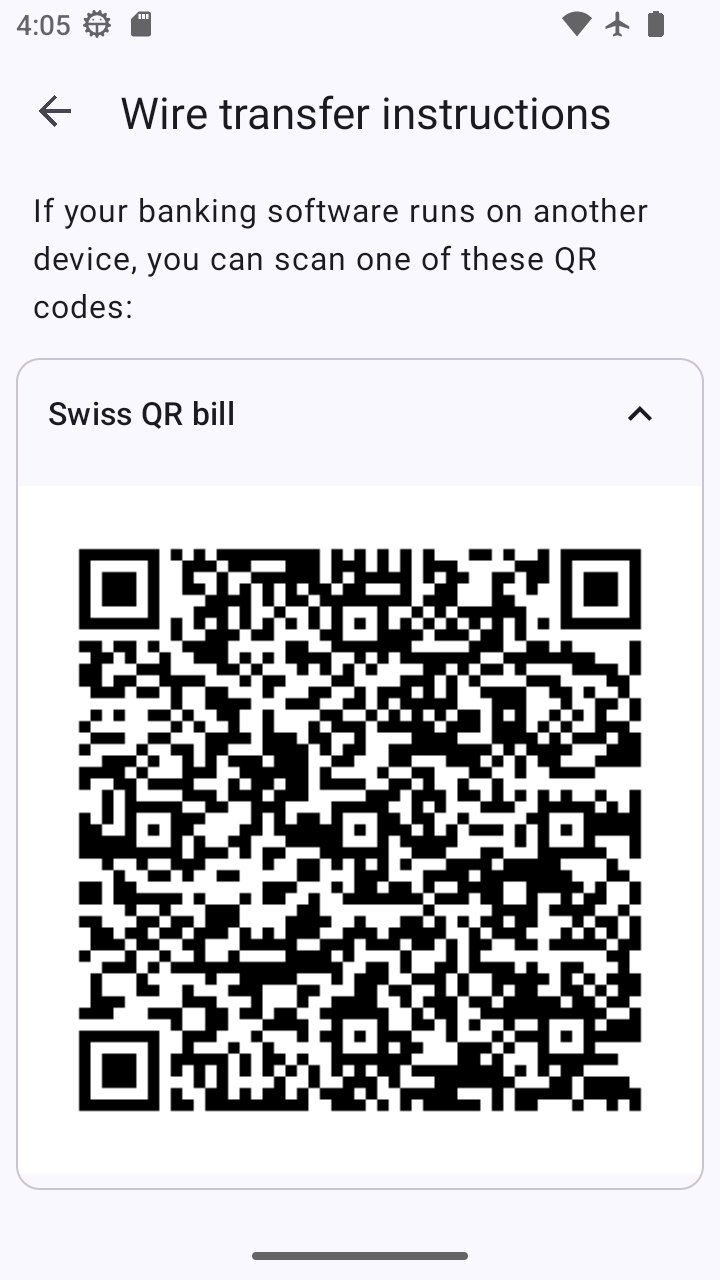
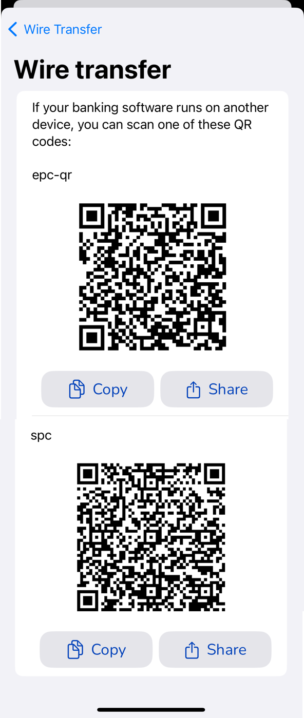
20.53.4.9. cta-wire-transfer-qr#
This screen shows the QR codes for the wire transfer for banks that support it.
20.53.4.9.1. Info#
QR codes for banking systems that could work with the respective exchange’s bank account
20.53.4.9.2. Actions#
back: goes back to the main wire transfer screen
copy (per QR code): copies image to the clipboard (?)
share (per QR code): opens link on local system (?)
Platform |
Screenshot |
|---|---|
WebEx |
FIXME |
Android |
|
iOS |
|
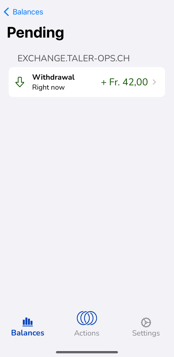
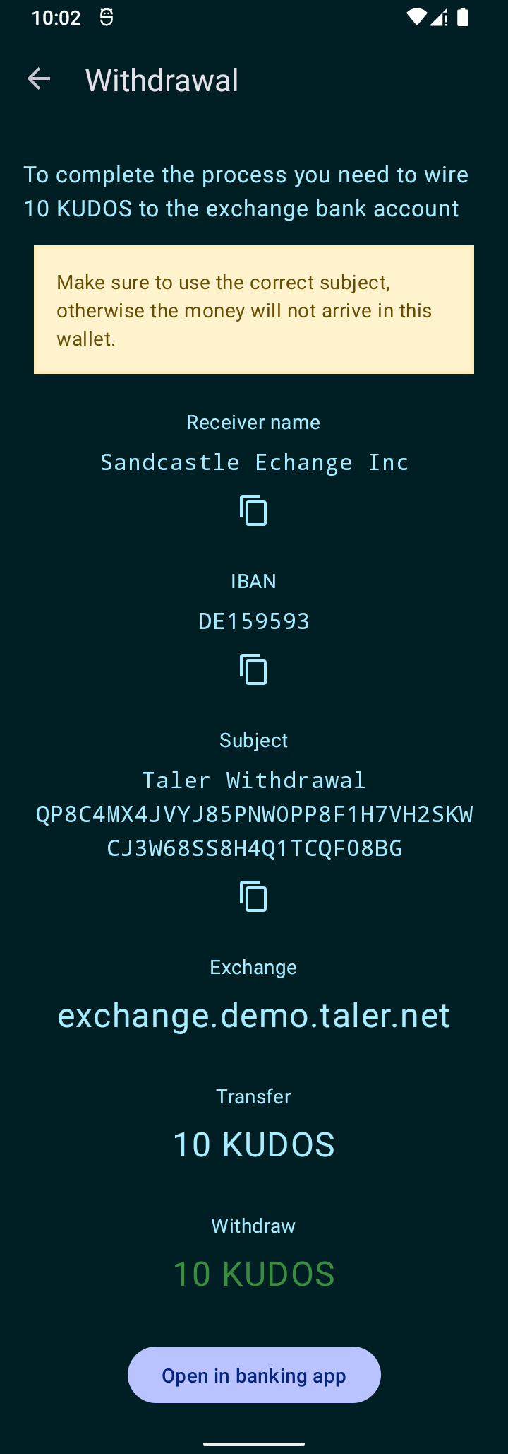
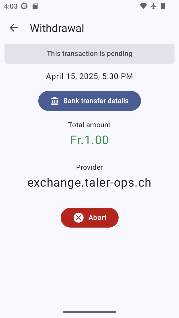
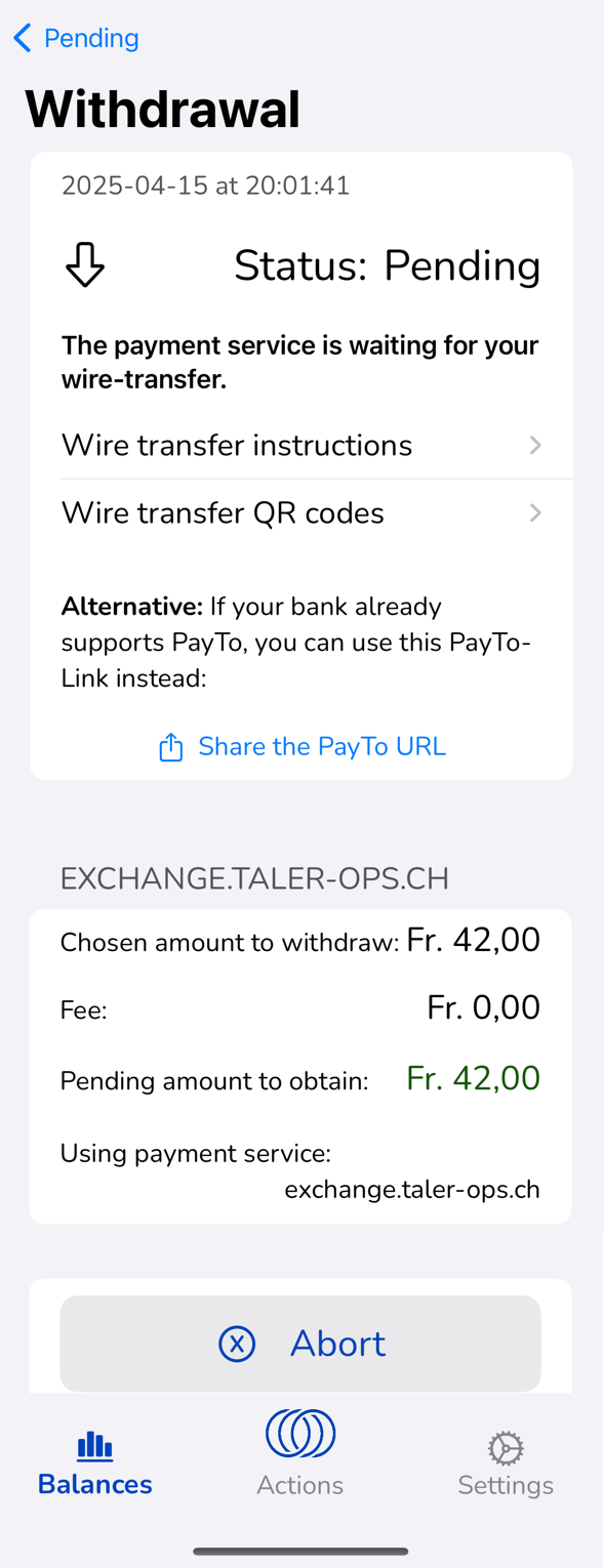
20.53.4.10. cta-withdraw-pending#
This screen is used to show the user the information for a pending wire transfer to complete a manual withdrawal operation when viewing the transaction via the pending transaction history (transactions-pending).
20.53.4.10.1. Info#
Same as in cta-wire-transfer-details.
20.53.4.10.2. Actions#
abort: aborts the withdrawal operation (with warning/explanation)
back: go back to the pending transaction list (operation continues in background)
view detailed instructions: go to cta-wire-transfer-details
view QR codes: go to cta-wire-transfer-qr
automatic: screen changes to cta-withdraw-done upon completion
20.53.4.10.3. Issues#
See cta-wire-transfer-details, same issues apply here.
Android(minor): screen might be a bit much, maybe partition like the iOS screen with separate screens for details / QR codes (especially give that there will be a 3rd option eventually as well!)
Android(text): Texts differ from iOS, iOS texts are clearer for the transaction details; exchange URL is too prominent
iOS(text): remove text URL in section header
iOS(minor): remove fees if fees are zero
20.53.4.10.4. Screenshots#
Platform |
Screenshot |
|---|---|
WebEx |
|
Android |
|
iOS |
|
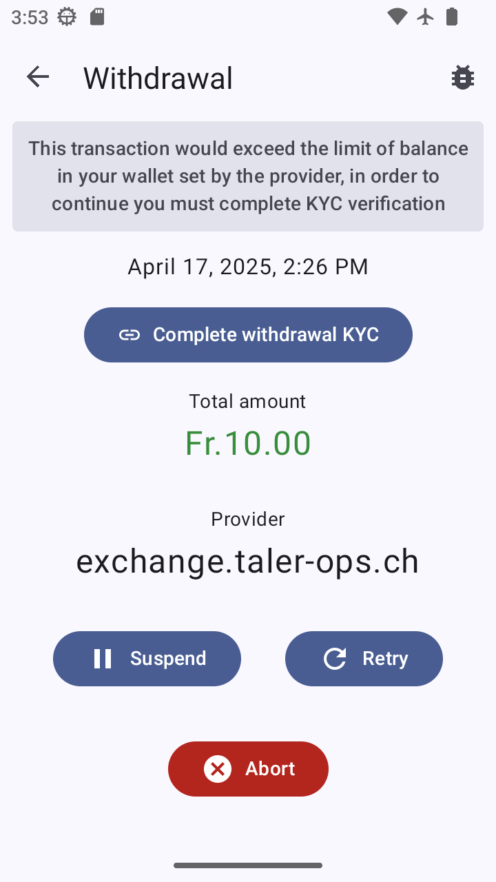
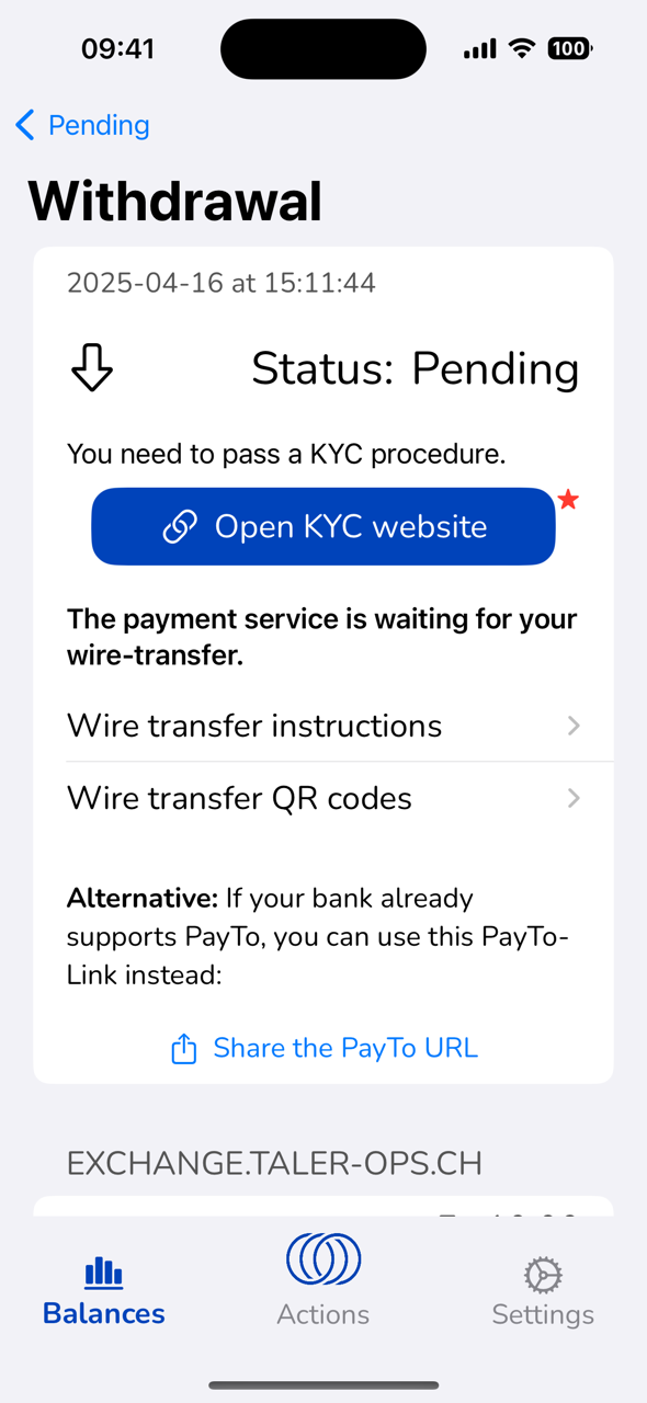
20.53.4.11. cta-withdraw-kyc#
This screen is used to inform the user that to proceed with a withdraw operation, they must pass a KYC check.
20.53.4.11.1. Info#
date
Text informing about “You need to pass a KYC procedure.”
amount wired (hidden if no fees)
fees paid (hidden if no fees)
total amount withdrawn into wallet (effective balance change)
20.53.4.11.2. Actions#
Open KYC website: opens KYC start URL
20.53.4.11.3. Issues#
iOS(major): not point in showing wire transfer instructions if the wire transfer was already done!
20.53.4.11.4. Adoption#
20.53.4.11.5. Screenshots#
Platform |
Screenshot |
|---|---|
WebEx |
FIXME |
Android |
|
iOS |
|
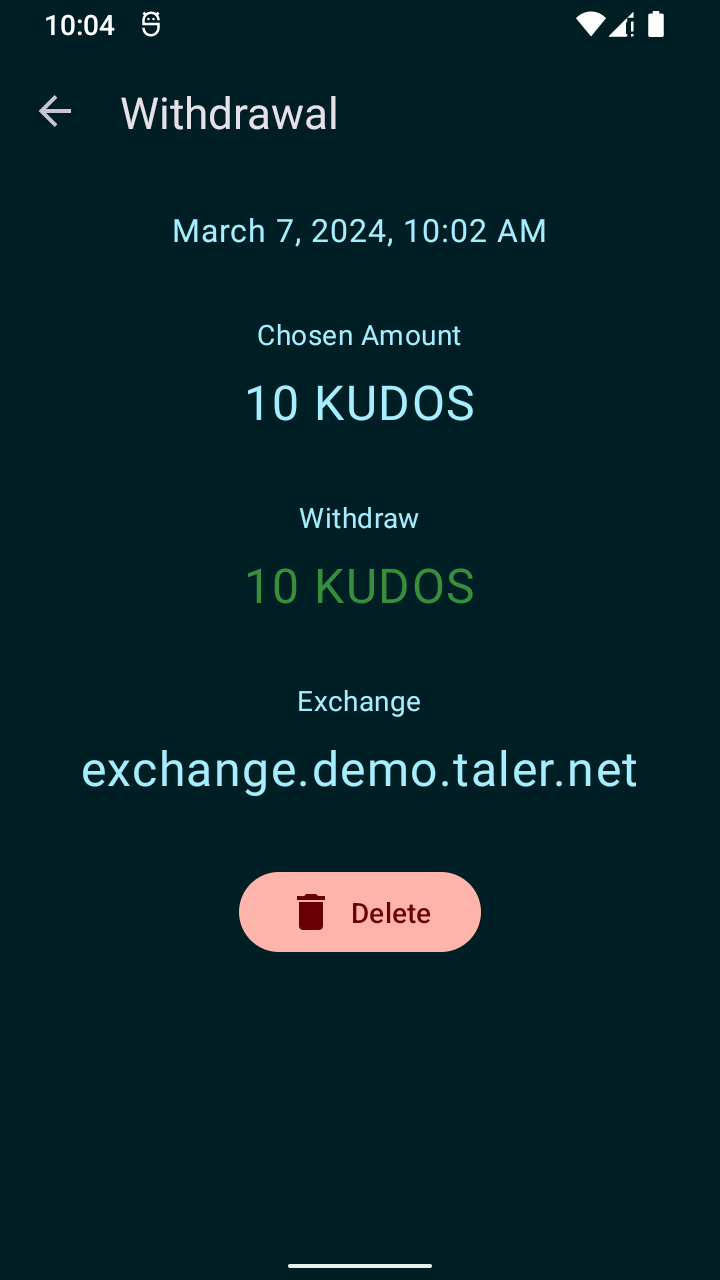
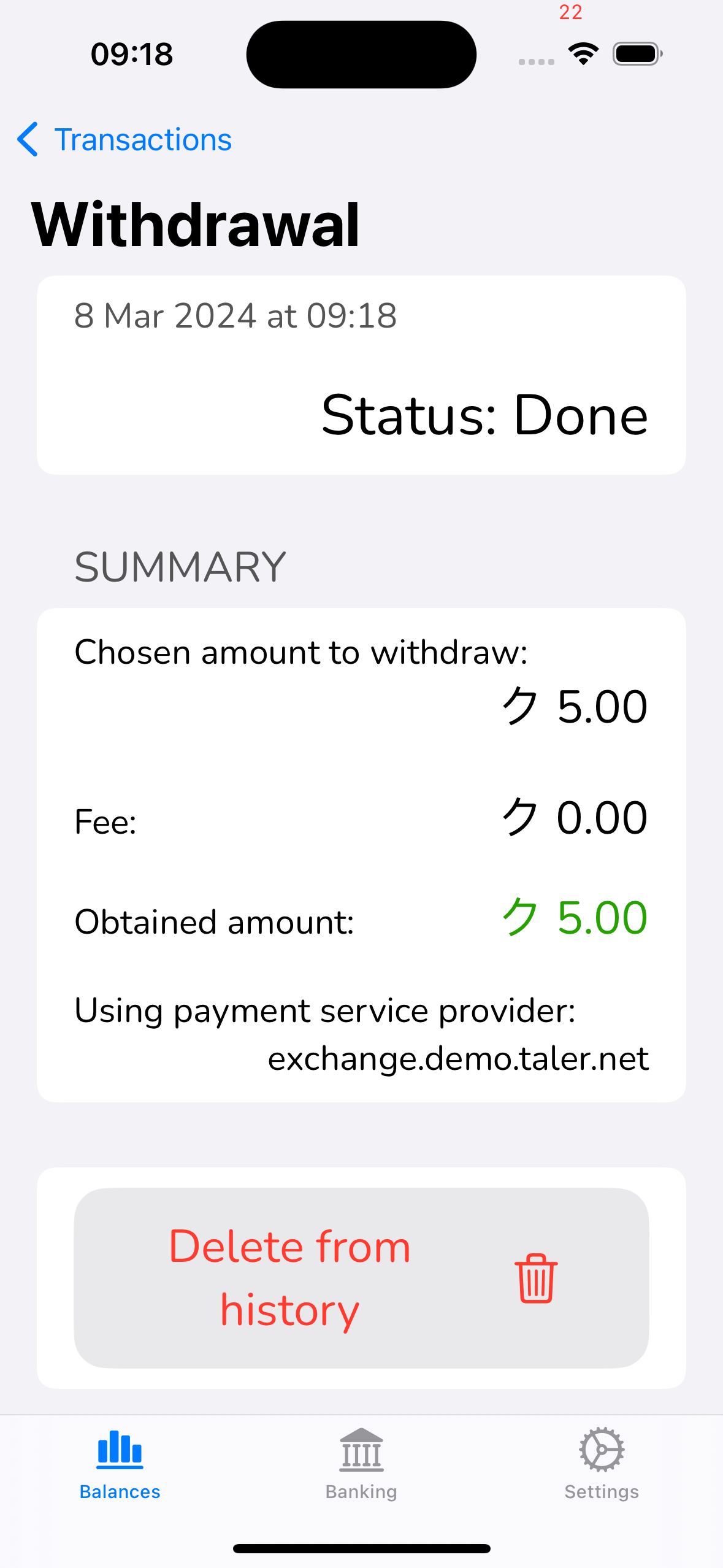
20.53.4.12. cta-withdraw-done#
This screen is used to show the user the information for a completed withdraw operation (bank-integrated or manual).
20.53.4.12.1. Info#
amount wired (hidden if no fees)
fees paid (hidden if no fees)
total amount withdrawn into wallet (effective balance change)
exchange base URL
date
20.53.4.12.2. Actions#
delete: deletes information about the withdrawal operation
20.53.4.12.3. Issues#
iOS(text): not point in showing details if there are no fees.
iOS(text): status: Done is unnecessary, if we show this screen, it will always be ‘done’ (ok, theoretically in the middle of withdrawing, but the wire transfer will be done; but then maybe show ‘incoming’ but hide the status once really “done”).
Android/Webext(text): “Delete” vs. ‘Delete from history” — two styles, two translations. Use “Delete from history” consistently!
20.53.4.12.4. Adoption#
We probably want to show a “pending” transaction if we are still withdrawing (wire transfer did arrived, coins are still being generated). That’s a very brief time, but we probably want to use a minor variation of this dialog in that case. Not sure it needs to be quite as prominent as on iOS though…
20.53.4.12.5. Screenshots#
Platform |
Screenshot |
|---|---|
WebEx |
|
Android |
|
iOS |
|
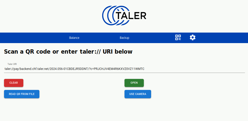
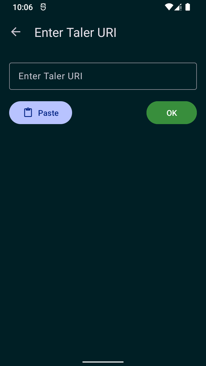
20.53.4.13. cta-url-entry#
This screen allows the user to scan a QR code, scan an NFC tag, or enter a taler://-URL. Its implementation may differ significantly between platforms. For example, scanning NFC tags may be fully automated, scanning QR codes may involve some system applications, and maybe the dialog only allows the URL entry or the camera but not both at the same time, depending on implementation specifics.
20.53.4.13.1. Info#
camera with current image to enable user to focus on QR code
current URL, with information if it is not well-formed for GNU Taler
possibly status information on NFC reader (if available)
20.53.4.13.2. Actions#
open: if entered manually, open URL as-entered (otherwise open is automatic)
back: return to previous view
20.53.4.13.3. Issues#
iOS (screenshot): lacks dialog (or screenshot?) entirely, not sure if we need manual URL-entry on mobile though, so could be OK!
20.53.4.13.4. Screenshots#
Platform |
Screenshot |
|---|---|
WebEx |
|
Android |
|
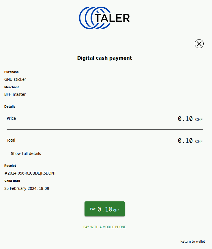
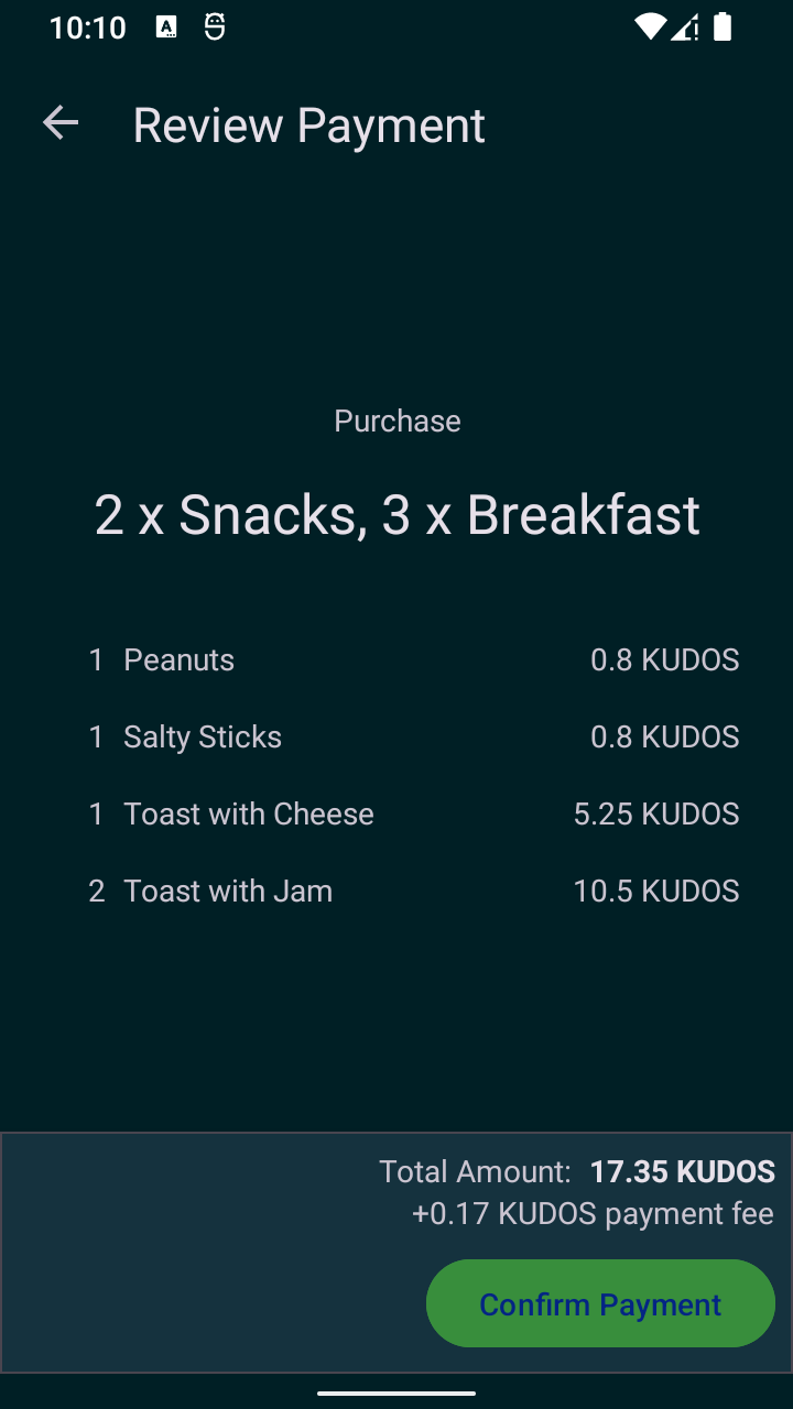
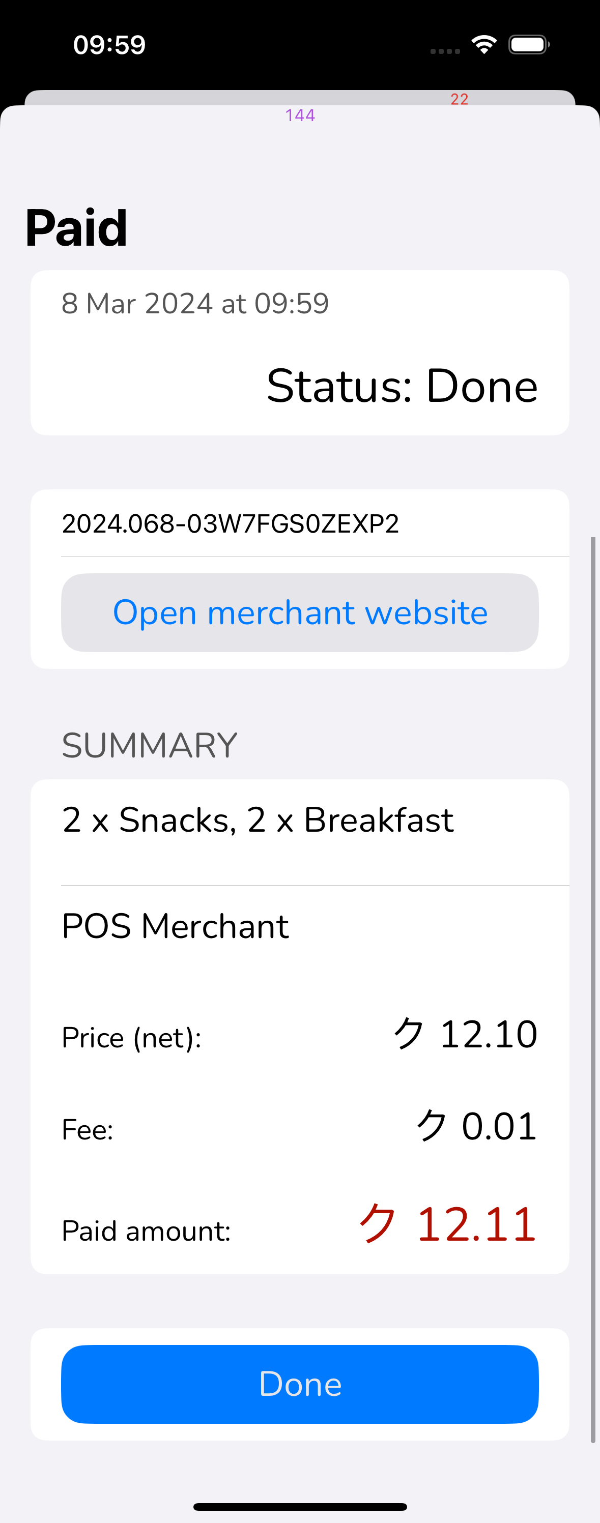
20.53.4.14. cta-payment#
This screen is used for the confirmation of a payment to a merchant. the success of this operation will be an decrease of the balance in the wallet and save a ticket/invoice of the purchase. fee, restrictions and ETA should be clear for the user.
20.53.4.14.1. Info#
merchant offering the order showing the URL
order summary
table of details of the operation: use the operation-table-details screen
receipt: order id
taler URI: show copy button or QR to complete the operation with another device (webex only)
cannot pay desc: if the user doesn’t have enough money, or if they have enough balance but unable to use it
payment status: if the order was already paid / repurchased / auto-paid
20.53.4.14.2. Actions#
Confirm payment: if the payment is possible, on success will be redirected to the
transaction-detailsscreen where the detail of the current transaction will be displayedget more cash: if there is not enough balance, it will be redirected to cta-withdraw
show full details: pops up dialog with full transaction details (everything from contract terms)
back/cancel: user will be redirected to balance-list
20.53.4.14.3. Issues#
WebEx(Text): “Valid until” is likely confusing, not shown on other platforms. Maybe only show “offer expired” instead of pay button (on all platforms!)?
Android/iOS(major): lack action to show full contract details
iOS(text): the label ‘Summary’ appears only on iOS, and seems unnecessary.
All(major): detailed layout differs significantly between platforms, needs review and unification!
All(screenshot): would be good to have sceenshots of the main variations: with/without product preview images, with/without fees, full details/partial details (if we have such a toggle).
20.53.4.14.4. Screenshots#
Platform |
Screenshot |
|---|---|
WebEx |
|
Android |
|
iOS |
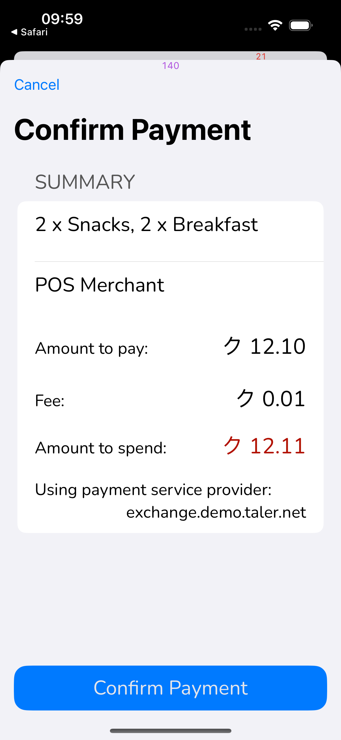
|
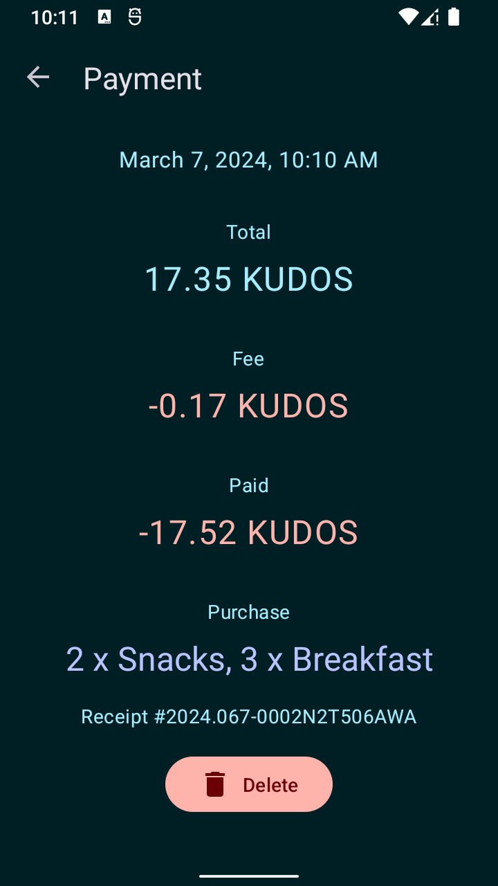
20.53.4.15. cta-payment-paid#
This screen is used to show information with details about a historic payment.
20.53.4.15.1. Info#
merchant offering the order showing the URL
order summary
table of details of the operation: use the operation-table-details screen
receipt: order id
payment status: if the order was refunded
Text to use:
Title. Name of the merchant paid (e.g. Essay Shop)
Status. It provides complementary information about the transaction for the user, such as the status of the transaction (e.g. “Waiting for confirmation,” “KYC required,” an error message, etc.). (The summary is provided by wallet-core, along with internationalized versions.)
Timestamp. The moment when the payment was made. Ideally, it should be shown with minimal precision, only showing the minutes, hours or days that have elapsed.
Amount. The negative impact that the transaction has in the total balance of the currency scope. It should be made clear that the amount is negative, ideally with a sign (-). Color (red) should not be used because of both psychological impact (people want to avoid red) and confusion with errors.
20.53.4.15.2. Actions#
delete: delete information about the transaction
open merchant website: opens fullfillment URL in browser (alternatively, dialog should show fulfillment message)
write NFC if the merchant sends totp codes, the wallet offers to write them via NFC (e.g. to a merchant vending machine) to prove the payment
show TOTP code presents the transferred totp codes
back: user will be redirected to
balance
20.53.4.15.3. Issues#
iOS(major): delete button is missing, instead only has “Done”
android(major): lacks button to open fulfillment URL in browser
WebEx(major): lacks button to open fulfillment URL in browser
20.53.4.15.4. Screenshots#
Platform |
Screenshot |
|---|---|
WebEx |
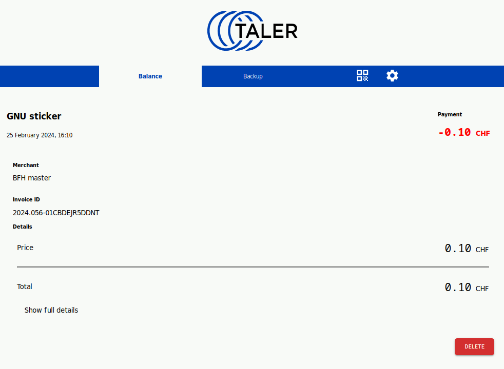
|
Android |
|
iOS |
|
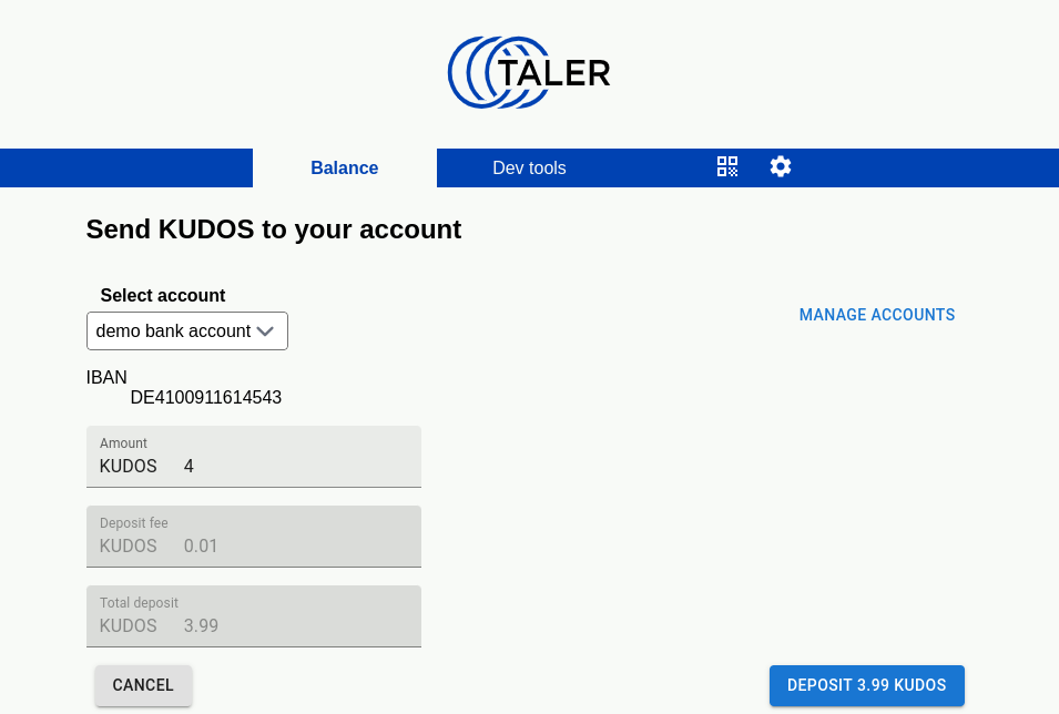
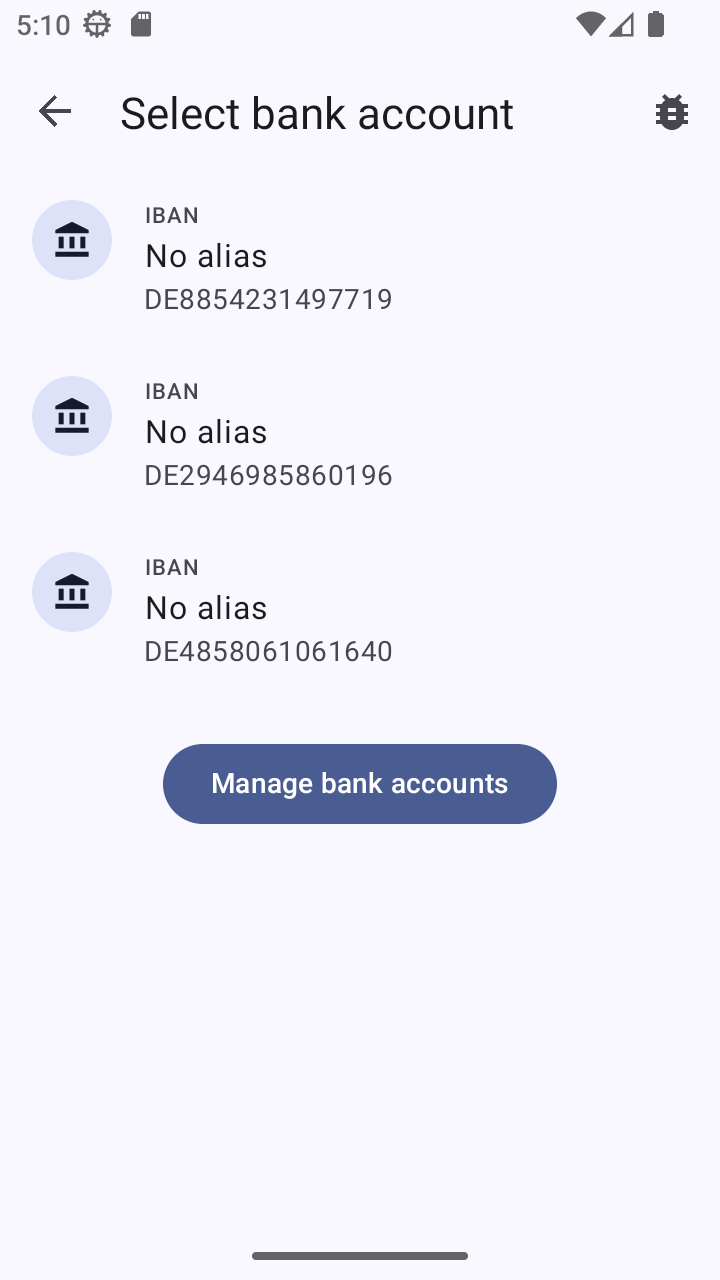
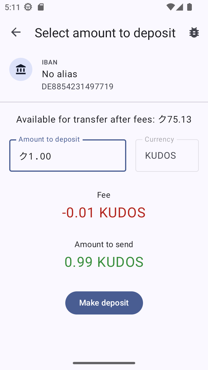
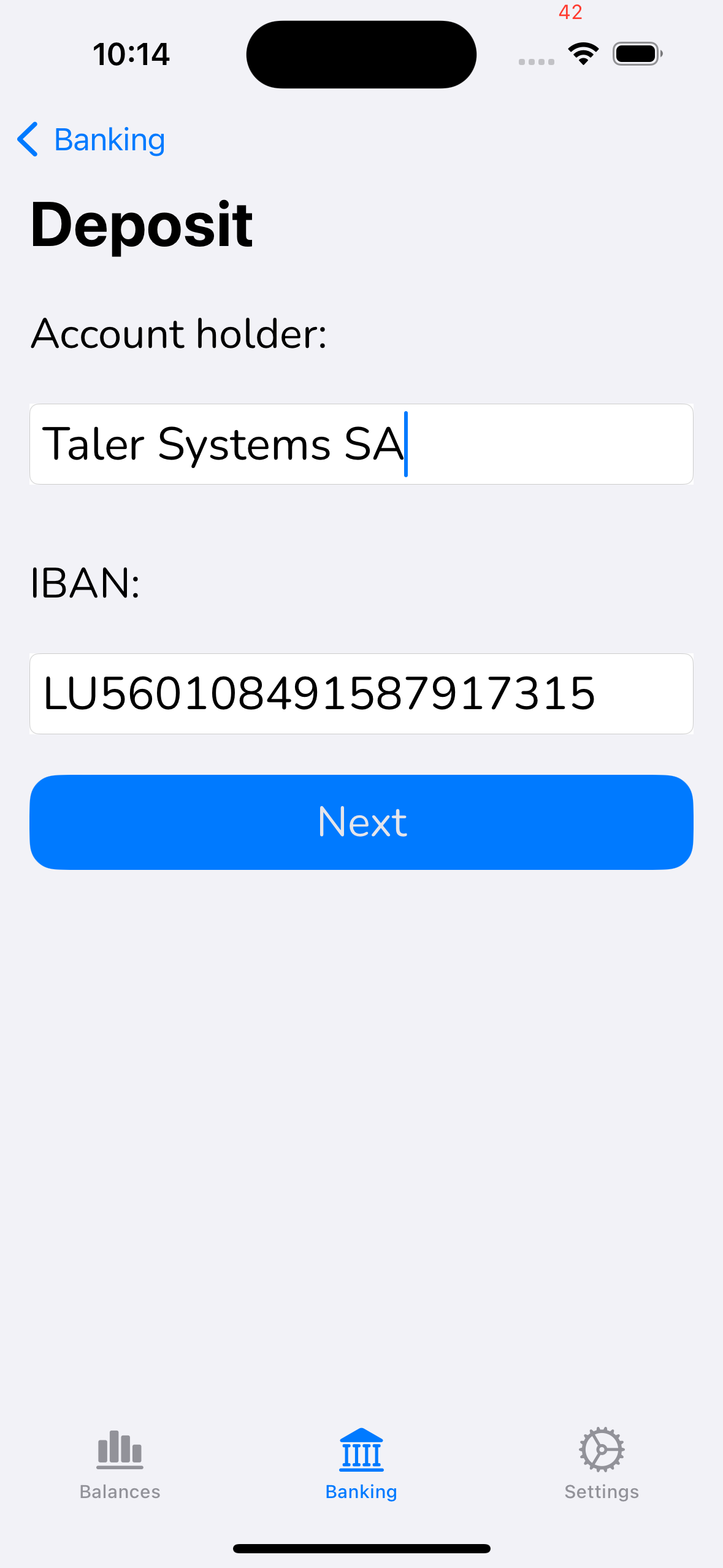
20.53.4.16. cta-deposit#
This screen is used for the confirmation of a deposit. the success of this operation will be an decrease of the balance in the wallet and save a deposit ticket for reference. fee, restrictions and ETA should be clear for the user.
20.53.4.16.1. Info#
bank account where the money is going to
table of details of the operation: use the operation-table-details screen
20.53.4.16.2. Actions#
confirm operation: on success will be redirected to the
transaction-detailsscreen where the detail of the current transaction will be displayedcancel: user will be redirected to
balance
Attention
User should be able to play with the amount, not possible in the current design
20.53.4.16.3. Issues#
WebEx(screenshot): need new section in this document for ‘ctx-manage-account’.
WebEx(minor): should probably separate out target account selection and amount entry, as done on iOS
WebEx(text): “amount” is a bad label, “brut amount” might be good, then use “net deposit”
WebEx(text): might be good to have “net deposit” amount also editable, not just computed (and then update “brut amount”).
Android(screenshot): lacks screenshots for dialogs where we enter/edit accounts and amounts
Android(minor): if we do it iOS/WebEx style, we can probalby skip the ‘pure’ confirmation dialog and have the one where the brut/net amounts are entered be the final one in the sequence before the transaction happens
all(screenshot): we need a new dialog showing the transaction in-flight/done as reachable via transaction history
20.53.4.16.4. Adoption#
iOS: I think it makes sense to split this section up into account selection / management and amount entry & confirmation; we should only have one major screen per section! Please split other UIs similarly and let’s introduce a new section here.
20.53.4.16.5. Screenshots#
Platform |
Screenshot |
|---|---|
WebEx |
|
Android |
|
iOS |
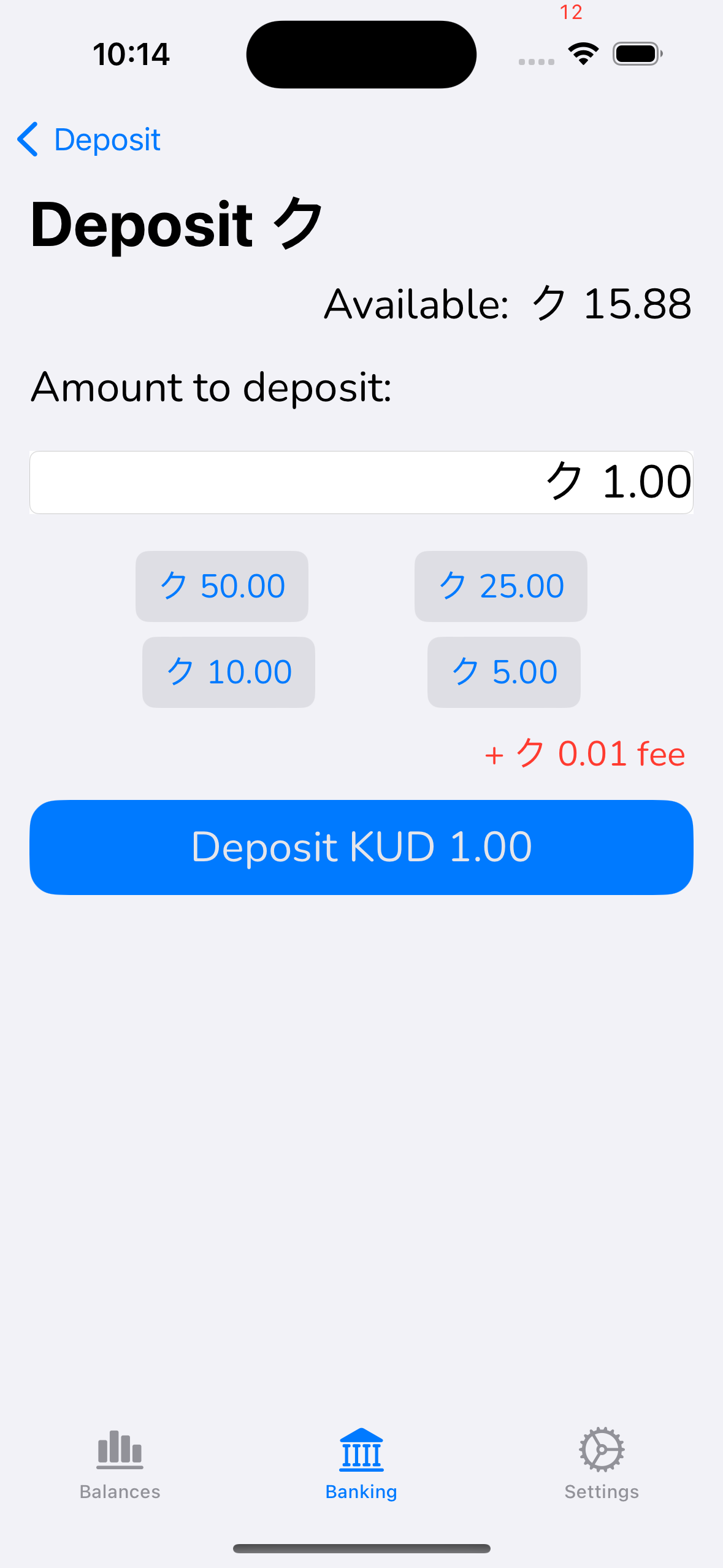
|
20.53.4.17. cta-bank-accounts#
20.53.4.17.1. Screenshots#
Platform |
Screenshot |
|---|---|
WebEx |
FIXME |
Android |
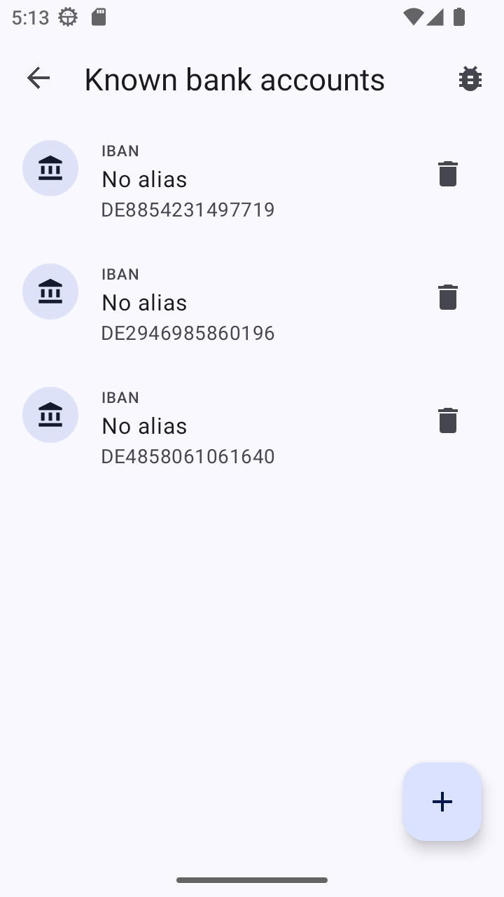
|
iOS |
FIXME |
20.53.4.18. cta-bank-account-edit#
Platform |
Screenshot |
|---|---|
WebEx |
FIXME |
Android |
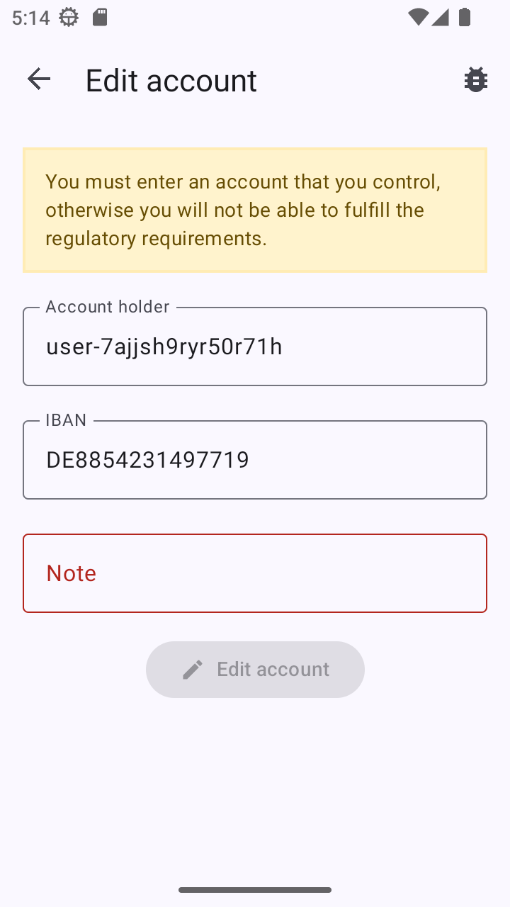
|
iOS |
FIXME |
20.53.4.19. cta-peer-pull-initiate#
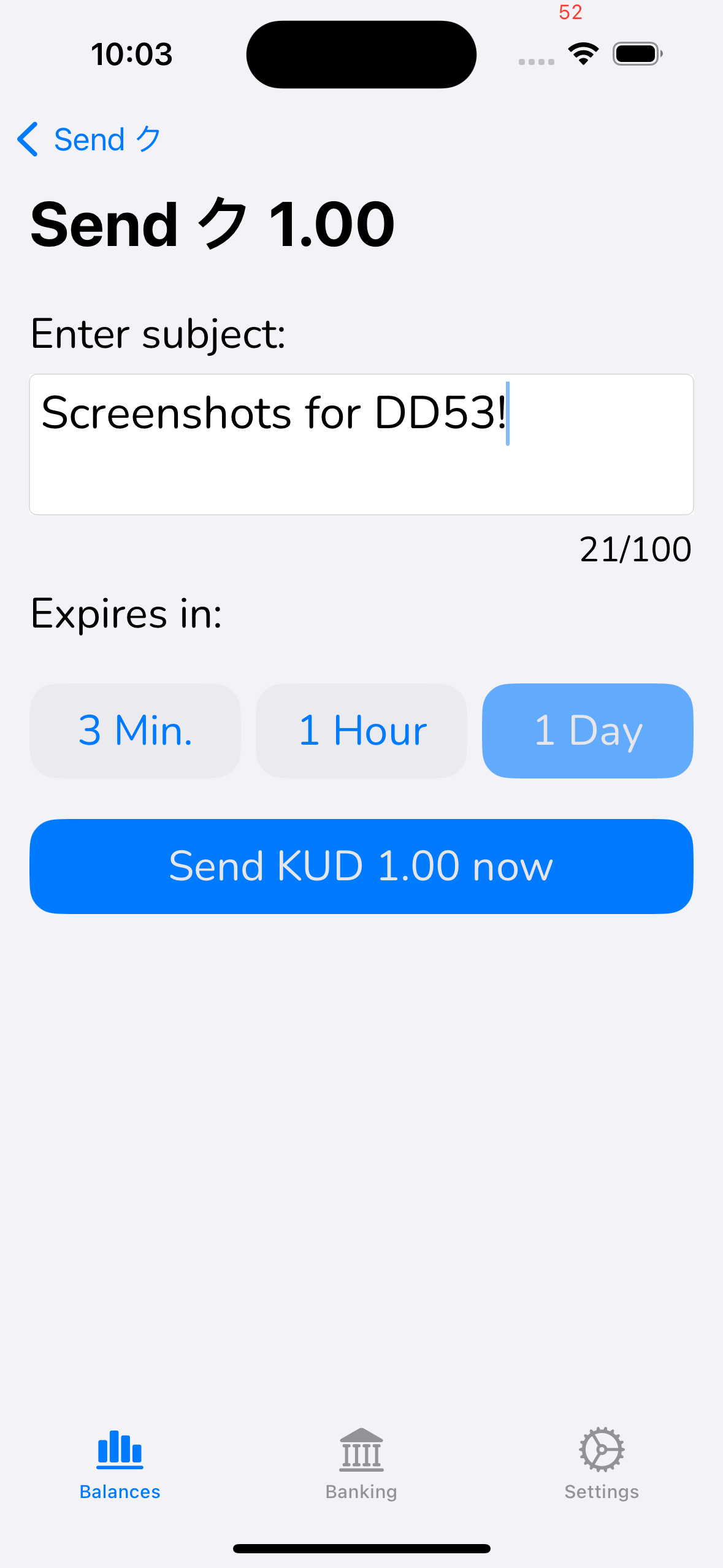
This screen is used for the confirmation of the creation of a peer pull transaction or invoice to request money from another wallet. the success of this operation will not change the balance immediately in the wallet and allow the user to share a taler URI to the payer. fee, restrictions and ETA should be clear for the user.
20.53.4.19.1. Info#
exchange to be used showing the URL
table of details of the operation: use the operation-table-details screen
20.53.4.19.2. Inputs#
subject: short description of the transaction
expiration: absolute time/date after which the invoice is not valid anymore
service provider: allow the selection of different exchange
20.53.4.19.3. Actions#
confirm operation: on success will be redirected to the
transaction-detailsscreen where the detail of the current transaction will be displayedreview and confirm ToS: if the current selected exchange has a version of ToS that the user didn’t yet accepted, use the accept-tos screen
cancel: user will be redirected to
balance
Attention
Is the invoice creation always free of charge or does the exchange have a mechanism to impose a fee to pay on creation?
20.53.4.19.4. Issues#
iOS(text): 3 min/ 1h are inconsistent; other wallets have 1 day, 7 days, 30 days. We should be consistent.
20.53.4.19.5. Adoption#
20.53.4.19.6. Screenshots#
Platform |
Screenshot |
|---|---|
WebEx |
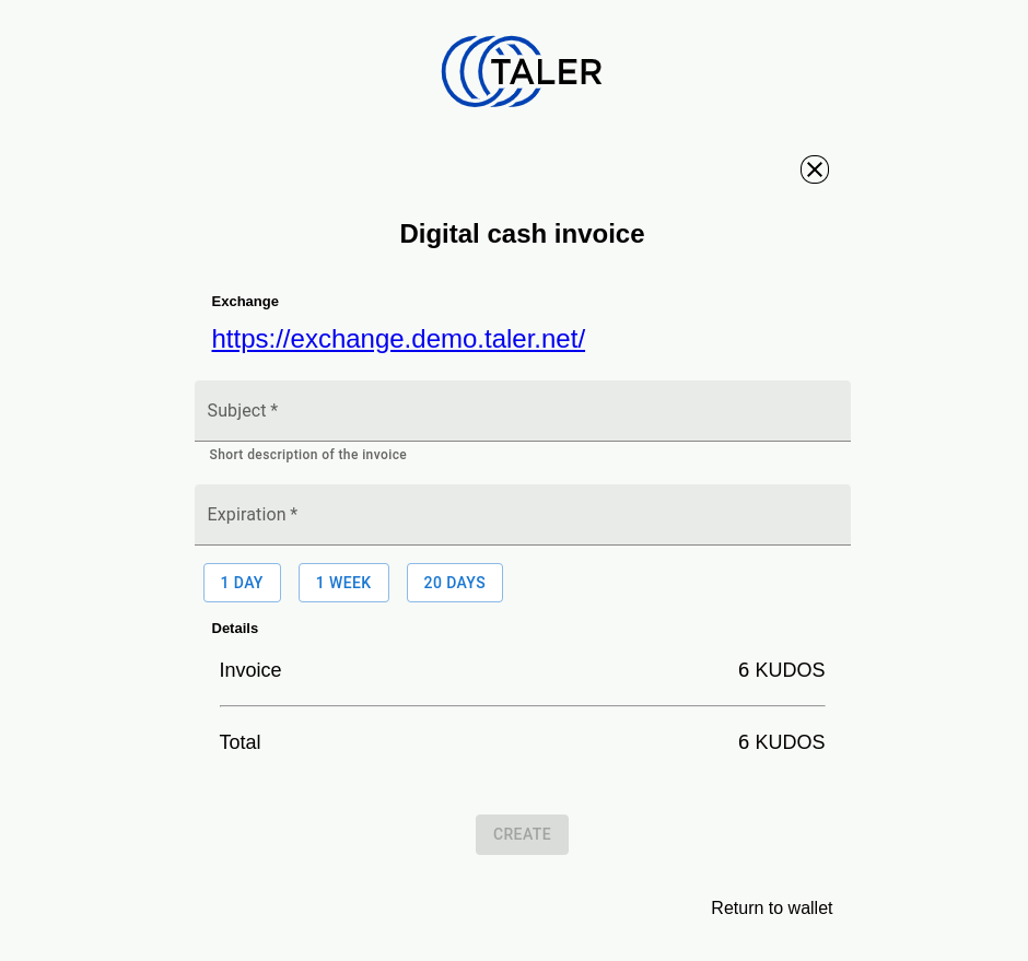
|
Android |
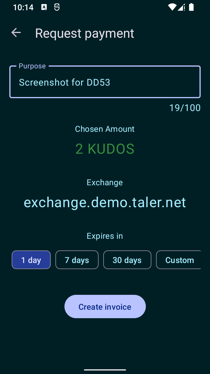
|
iOS |
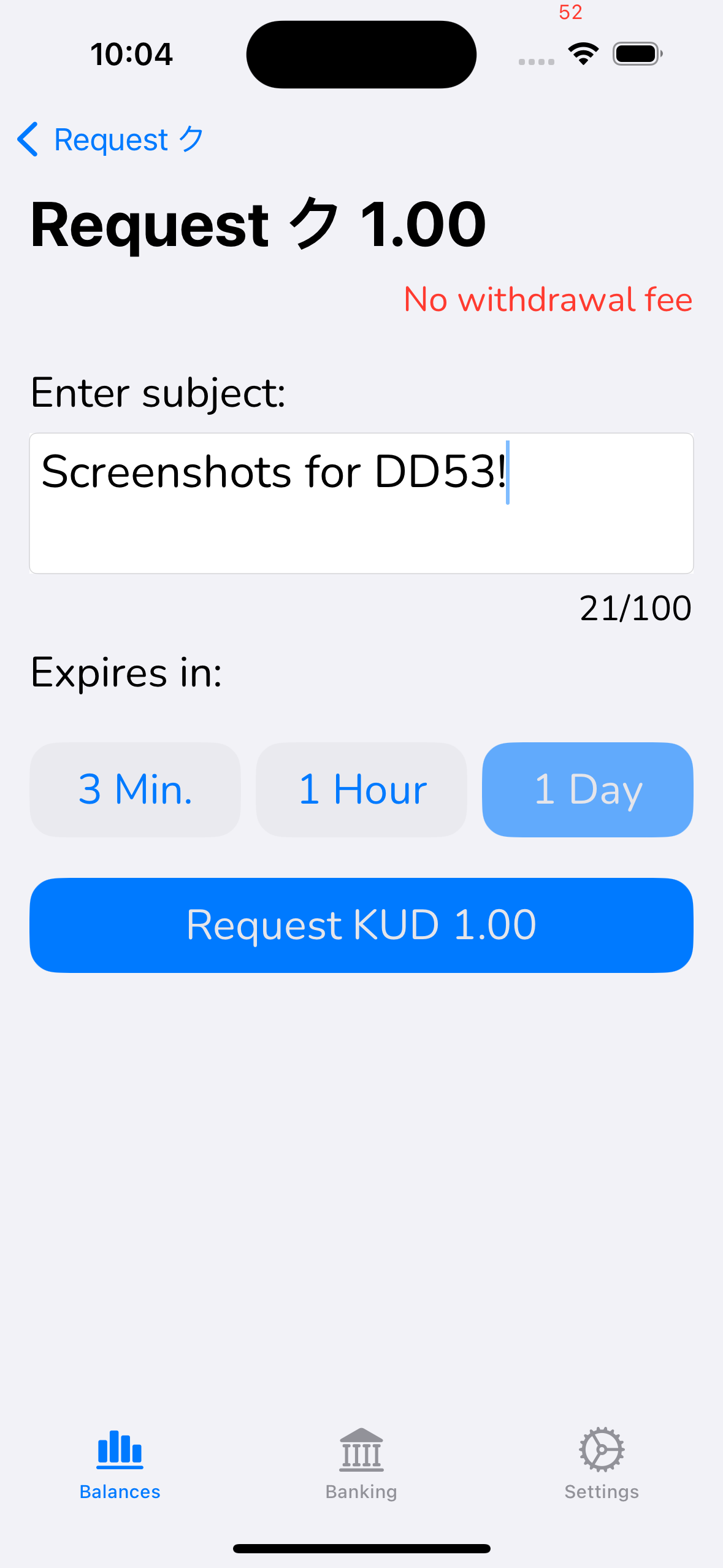
|
20.53.4.20. cta-peer-pull-confirm#
This screen is used for the confirmation of the payment of a peer pull transaction or invoice to send money from another wallet. the success of this operation will be an will decrease the balance in the wallet. fee, restrictions and ETA should be clear for the user.
20.53.4.20.1. Info#
exchange to be used showing the URL
subject: short description of the transaction
table of details of the operation: use the operation-table-details screen
expiration: absolute time/date after which the invoice is not valid anymore
20.53.4.20.2. Actions#
confirm operation: if the payment is possible, on success will be redirected to the
transaction-detailsscreen where the detail of the current transaction will be displayedget more cash: if there is not enough balance, it will be redirected to cta-withdraw
cancel: user will be redirected to
balance
20.53.4.21. cta-peer-push-initiate#
This screen is used for the confirmation of the creation of a peer push transaction or transfer money to another wallet. the success of this operation will reduce the balance immediately in the wallet and allow the user to share a taler URI to the receiver. fee, restrictions and ETA should be clear for the user.
20.53.4.21.1. Info#
table of details of the operation: use the
operation-table-detailsscreen
20.53.4.21.2. Inputs#
subject: short description of the transaction
expiration: absolute time/date after which the transfer is not valid anymore
20.53.4.21.3. Actions#
confirm operation: on success will be redirected to the
transaction-detailsscreen where the detail of the current transaction will be displayedcancel: user will be redirected to
balance
20.53.4.21.4. Issues#
WebEx(minor): forces user to scroll to the bottom. Android nicely shows the accept button always; that seems nicer;
WebEx(text): has text about “Digital cash withdrawal” above. Would be more consistent if we also only showed the Terms of service.
Android(text): uses “Exchange”, should say “PSP’s Terms of Service”
iOS(screenshot): lacks actual ToS, not ideal to compare!
20.53.4.21.5. Adoption#
20.53.4.21.6. Screenshots#
Platform |
Screenshot |
|---|---|
WebEx |
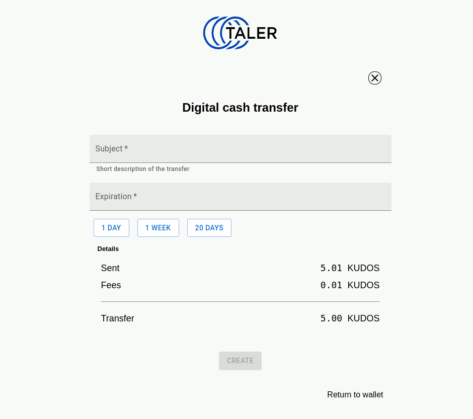
|
Android |
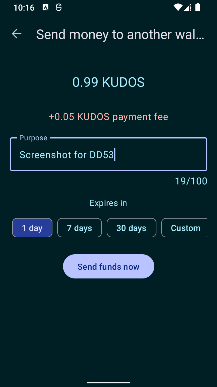
|
iOS |
|
20.53.4.22. cta-peer-push-confirm#
This screen is used for the confirmation of the acceptance of a peer push transaction or transfer money to this wallet. the success of this operation will be an will decrease the balance in the wallet. fee, restrictions and ETA should be clear for the user.
20.53.4.22.1. Info#
subject: short description of the payment
expiration: absolute time/date after which the invoice is not valid anymore
table of details of the operation: use the
operation-table-detailsscreen
20.53.4.22.2. Actions#
confirm operation: on success will be redirected to the
transaction-detailsscreen where the detail of the current transaction will be displayedreview and confirm ToS: if the current selected exchange has a version of ToS that the user didn’t yet accepted, use the accept-tos screen
cancel: user will be redirected to
balance
20.53.4.22.3. Issues#
All(screenshot): we have no screenshots!
20.53.4.22.4. Adoption#
20.53.4.22.5. Screenshots#
20.53.4.23. operation-table-details#
With the table it should be clear how much the operation will cost, the initial amount and the final amount with all the items related to the operations (like fee)
20.53.4.23.1. Labels#
Initial amount of the operation, and final amount are always shown. Fee should be shown as an extra row in the table if it is non-zero. Converted amount should be shown as an extra row if initial amount currency is not the same as the final amount currency.
Initial amount label by operation:
payment -> Price
deposit -> Send
peer-pull-credit -> Invoice
peer-pull-debit -> Invoice
peer-push-debit -> Send
peer-push-credit -> Transfer
withdrawal -> Transfer
refund -> Refund
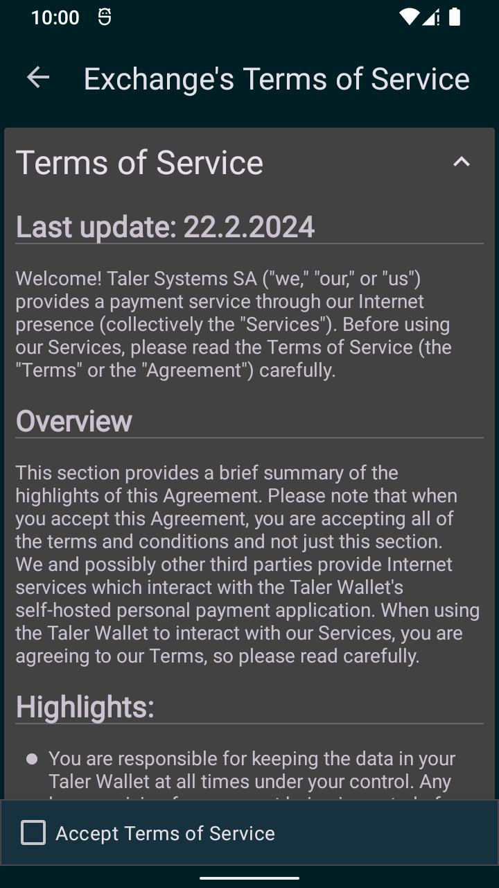
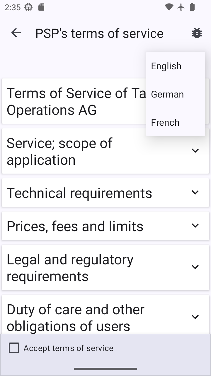
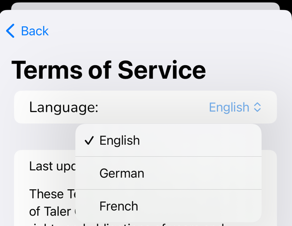
20.53.4.24. accept-tos#
This screen can be use everytime that the user is going to interact with an exchange. Since at any moment wallet may find that ToS changed the user needs to be prevented from continue before reading/accepting new rules. If possible, this screen should be used in place of other actions and hidden if not required (for example, user already accepted ToS).
20.53.4.24.1. Inputs#
languange: allow the selection of a languange different from system lang
20.53.4.24.2. Actions#
accept tos: will mark this version as accepted in wallet core and redirect the user to the screen from where it was invoked
export/save/print tos (optional): will save the ToS outside of the wallet
20.53.4.24.3. Issues#
all(minor): All platforms seem to lack export/save as/print functionality
20.53.4.24.4. Adoption#
20.53.4.24.5. Screenshots#
Platform |
Screenshot |
|---|---|
WebEx |
|
Android |
|
iOS |
|
Platform |
Screenshot |
|---|---|
WebEx |
FIXME |
Android |
|
iOS |
|
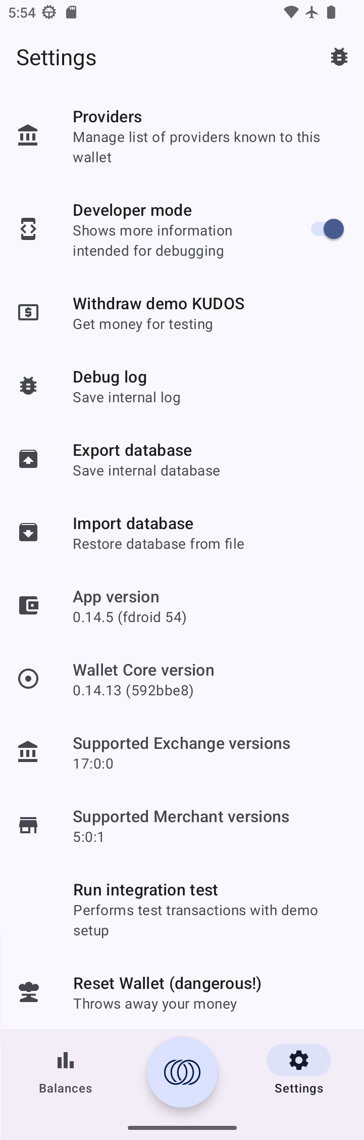
20.53.4.25. settings#
20.53.4.25.1. Info#
20.53.4.25.2. Layout#
20.53.4.25.3. Actions#
20.53.4.25.4. Issues#
20.53.4.25.5. Adoption#
20.53.4.25.6. Screenshots#
Platform |
Screenshot |
|---|---|
Android |
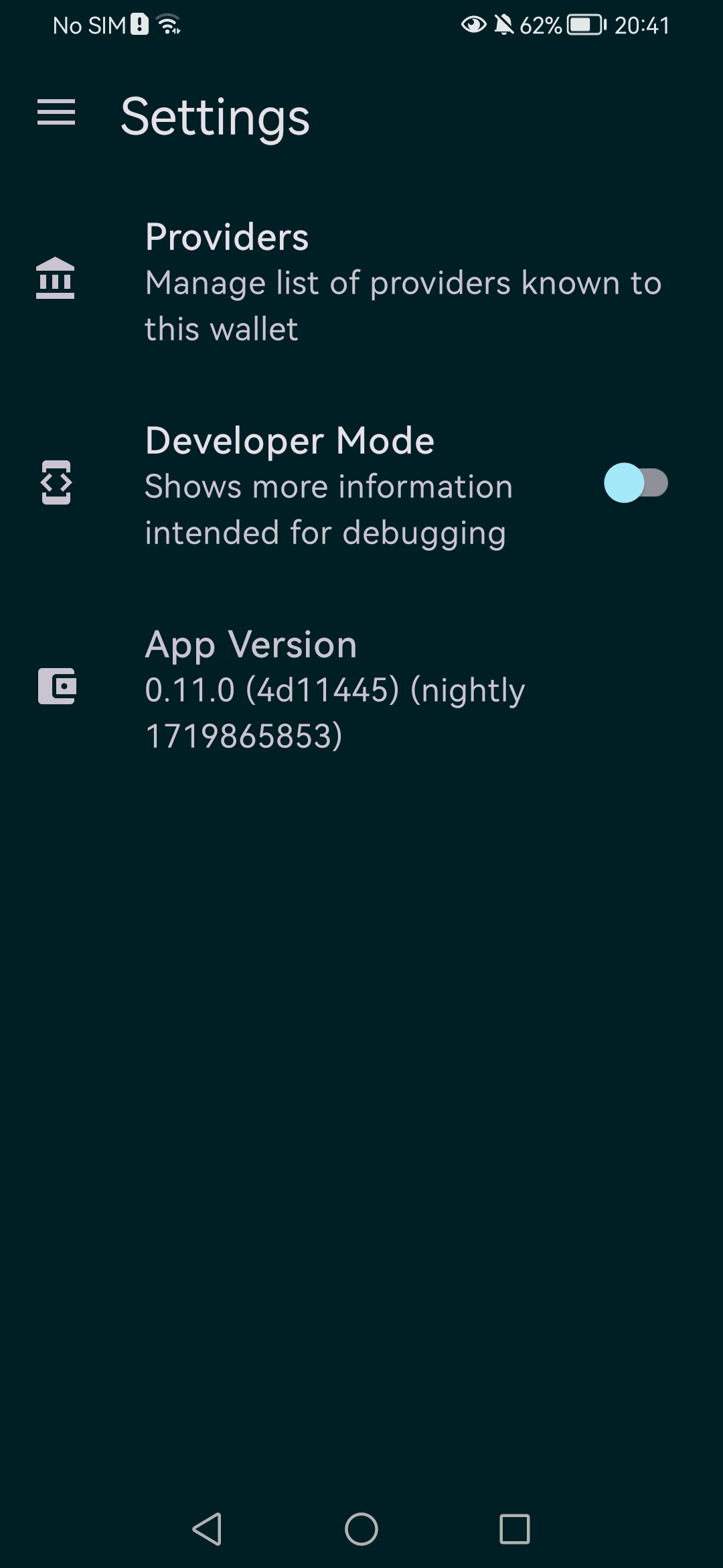
|
iOS |
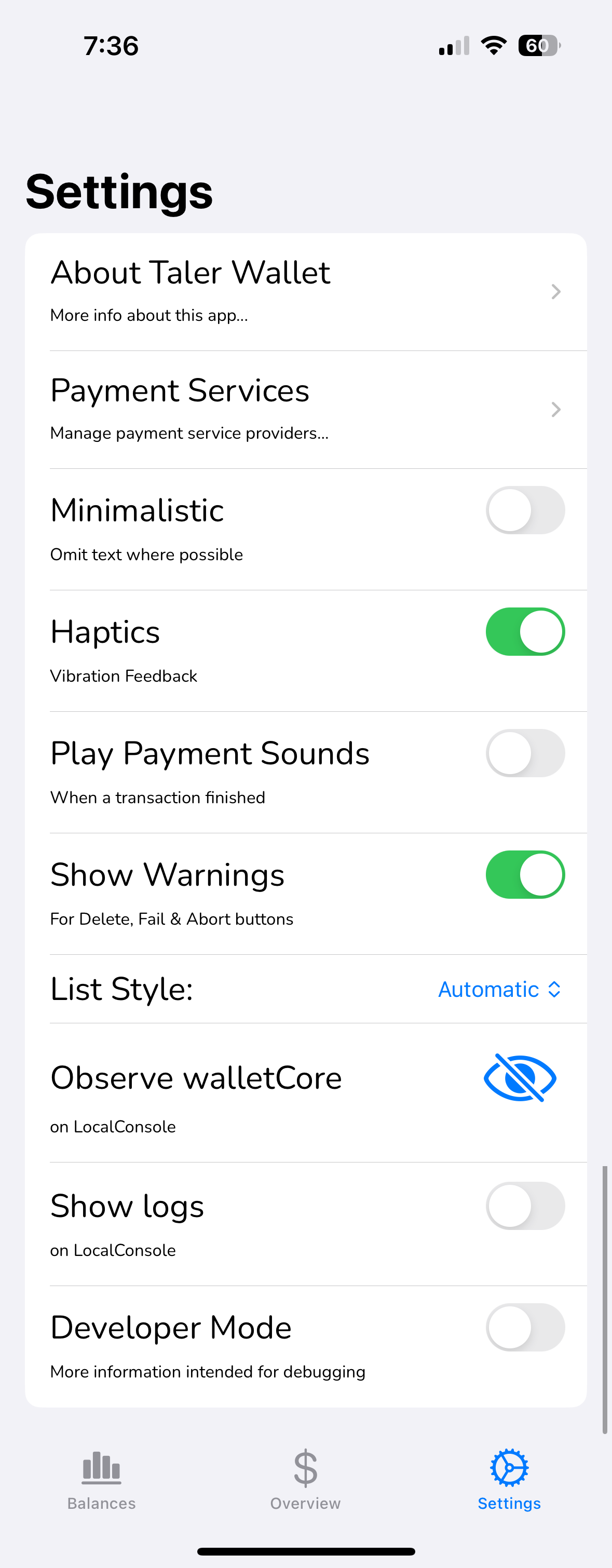
|
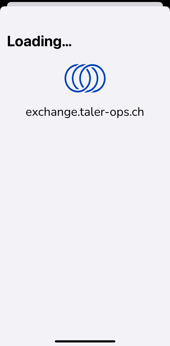
20.53.4.26. cta-exchange-loading#
20.53.4.26.1. Info#
This screen is shown while the wallet downloads and parses the exchange meta-data (/config, /keys, terms of service).
20.53.4.26.2. Layout#
20.53.4.26.3. Actions#
20.53.4.26.4. Issues#
20.53.4.26.5. Adoption#
20.53.4.26.6. Screenshots#
Platform |
Screenshot |
|---|---|
WebEx |
FIXME |
Android |
|
iOS |
|
20.53.4.27. developer-tools#
20.53.4.27.1. Info#
20.53.4.27.2. Layout#
20.53.4.27.3. Actions#
20.53.4.27.4. Issues#
20.53.4.27.5. Adoption#
20.53.4.27.6. Screenshots#
Platform |
Screenshot |
|---|---|
Android |
|
iOS |
FIXME |