20.90. DD 90: Branding Guidelines#
20.90.1. Summary#
This document defines visual and UX guidelines for Taler payment pages/components to give user a consistent experience across different implementations and platforms.
20.90.2. Motivation#
Make Taler QR code pages/components recognizable and consistent to increase user trust and confidence when using Taler. A consistent payment components also reduce user hesitation and makes troubleshooting easier. Provide guidelines for logo usage and provide main colors to be used.
20.90.3. Requirements#
20.90.4. Proposed Solution#
20.90.4.1. Logo#
The Taler logo is the most recognizable visual element of the brand and must be used consistently across all products, websites, documents, and payment-related screens. This section defines the approved logo versions, when each version should be used, and the rules that protect the logo’s visibility and integrity.
20.90.4.1.1. Primary Logo (Light Mode)#
The primary logo is the default Taler logo version and should be used on light backgrounds whenever possible. It is the preferred option for websites, wallet screens, documentation, printed materials etc. with a white or very light surface.
This version should always appear with sufficient contrast against the background so that all logo elements remain clearly visible. It must be reproduced exactly as provided in the official assets, without modification to its colors, proportions, or internal spacing.
20.90.4.1.2. Logo for Dark Mode#
The dark mode logo is a dedicated version of the Taler logo optimized for dark backgrounds. It should be used in wallet dark theme screens, dark websites, dark presentation slides, and any surface where the primary light-mode logo would lose visibility or contrast.
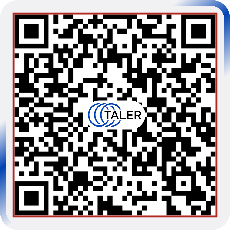
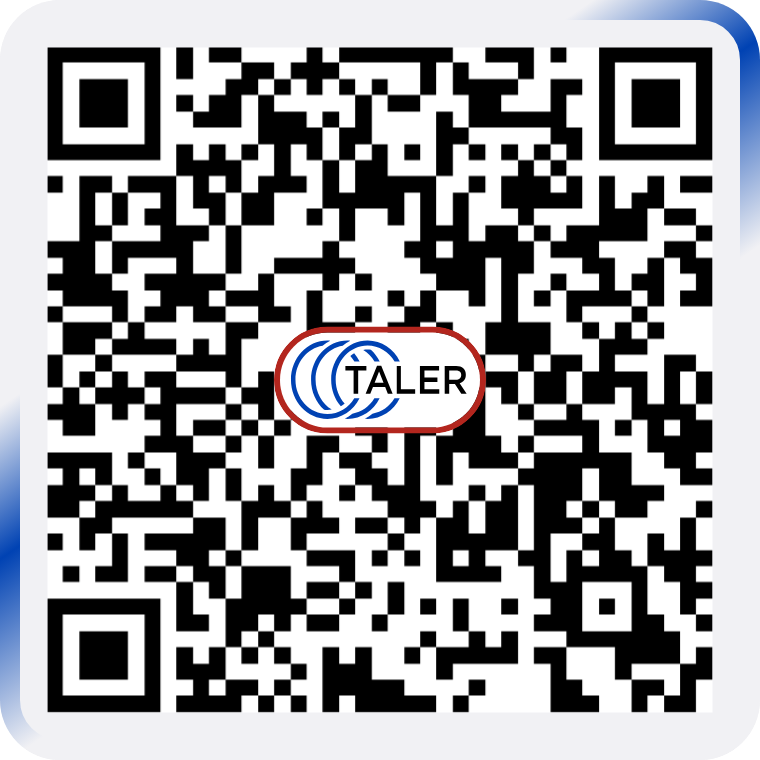
20.90.4.1.3. Incorrect usage examples#
The Taler logo must always appear in its approved form. Any distortion or reinterpretation weakens the identity and creates inconsistency across products.
The following uses are not allowed:
changing the logo colors outside approved variants
placing the light-mode logo on a light background with poor contrast
placing the dark-mode logo on additional background
stretching, compressing, or otherwise distorting the proportions
rotating the logo
adding shadows, outlines, gradients, or glow effects
rearranging the logo symbol and wordmark
placing the logo on visually busy backgrounds that reduce readability
cropping the logo
Every implementation should use the original source files supplied by the Taler design assets. When in doubt, choose the version that gives the highest contrast and clearest presentation while preserving the official logo artwork.
20.90.4.2. Colors#
The Taler color system defines the visual foundation of the brand across product interfaces, websites, documentation, and payment-related screens. Colors should support clarity, trust, accessibility, and consistency. This section identifies the main brand colors that represent Taler visually, as well as secondary colors used to support interface design and communication.
20.90.4.2.1. Primary colors#
The primary color should be used on light backgrounds for the most important brand and interface elements, such as primary actions, highlights, and key visual accents.
#0042b3 The dark primary color should be used in dark mode interfaces, where the default primary color would not provide the desired visual balance or contrast.
#b4c5ff 20.90.4.2.2. Secondary colors#
The secondary color supports the primary color and can be used for less prominent accents, supporting interface elements, and complementary highlights.
#586a88 The dark secondary color should be used in dark mode where the standard secondary color is not suitable.
#a4c9ff 20.90.4.2.3. Additional color definitions#
Detailed color values and any future extensions of the palette are available here: Color scheme.
..payment-qr
20.90.4.3. Payment QR code design#
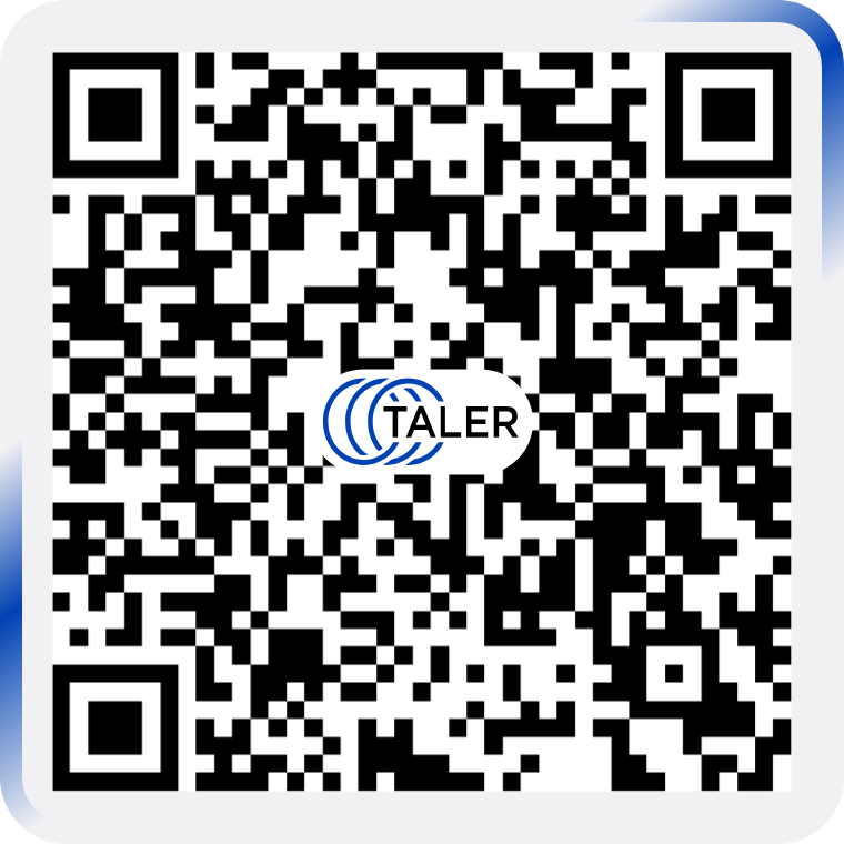
The payment QR code is displayed inside a dedicated rounded frame that occupies 100% of the component size.
This frame defines the full visible area of the QR payment element and serves as the main reference for all internal proportions.
The frame uses the color #F1F1F4. Inside the frame, the QR code itself is rendered on a white background to preserve maximum
contrast and scanning reliability.
20.90.4.3.1. Frame#
The QR payment component uses a rounded rectangular frame with the following properties:
frame size:
100%frame background color:
#F1F1F4frame shape: rounded rectangle
frame corner radius:
8%relative to the frame size
20.90.4.3.2. QR code#
The QR code is centered inside the frame and occupies 87.5% of the frame size.
The QR code must always use: - white background - black QR modules - centered placement inside the frame
The QR code background must remain white even though the surrounding frame uses #F1F1F4. This separation ensures good readability and reliable scanning.
20.90.4.3.3. Animated lines#
Two animated lines move clockwise along the outer edge of the QR code frame as a subtle branded accent. The animation adds a sense of activity and visual focus while keeping the QR code itself visually stable and easy to scan.
The animated lines have the following properties:
direction: clockwise
stroke width:
2.6%relative to the frame sizeline height:
57%relative to the frame sizecolor: linear gradient from
#F1F1F4to#0042B3to#F1F1F4placement: along the inner edge of the frame, between the frame border and the QR code area
20.90.4.3.4. Logo inside the QR code#
The Taler logo is placed in the center of the QR code. The logo must always appear together with its dedicated white background shape so that it remains visually separated from the QR modules behind it.
The approved asset for this usage is available here: PNG, SVG.
The total height of the logo together with its white background is 12.5% relative to the frame size.
The logo treatment must always follow these rules: - the logo is centered inside the QR code - the logo always includes the white background - the logo background must match the white QR background - the logo must not be recreated manually - only the approved asset may be used
20.90.4.3.5. Size summary#
The payment QR component uses the following proportions:
frame size:
100%QR code size:
87.5%animation width:
2.6%logo with background height:
12.5%
20.90.5. Test Plan#
(If this DD concerns a new or changed feature, describe how it can be tested.)
20.90.6. Definition of Done#
(Only applicable to design documents that describe a new feature. While the DoD is not satisfied yet, a user-facing feature must be behind a feature flag or dev-mode flag.)
20.90.7. Alternatives#
20.90.8. Drawbacks#
20.90.9. Discussion / Q&A#
(This should be filled in with results from discussions on mailing lists / personal communication.)