20.94. DD 94: Discounts & Passes Wallet UI#
20.94.1. Summary#
This document describes the design and behavior of all wallet screens related to discounts and passes. It defines a unified way to present, manage, and display these entities across the wallet, including their states, structure, and visual representation.
20.94.2. Motivation#
Merchants can provide users with discounts or passes that apply to specific products or services. The wallet must support:
Clear presentation of available discounts and passes
Ability for users to review and apply them during checkout
Overview of all owned items, including:
Currently active
Not yet active (future validity)
Available for use
A consistent design ensures users can easily understand what benefits they have, when they can use them, and how they affect their purchases.
20.94.3. Requirements#
The wallet must provide separate pages for discounts and passes.
Discounts and passes must be grouped into two tabs:
Available: active items and items valid in the future.
Expired: expired, redeemed, or used items.
Each discount and pass must be displayed as a card with consistent layout and styling.
Cards must show the item name, description, merchant information, validity information, and quantity badge when applicable.
Active items must be visually distinguished from future items.
Future items must clearly show when they become valid.
Expired items must clearly show their full validity period.
Redeemed discounts must provide a link to the related order details page.
Used passes must provide a link to related orders when applicable.
The quantity badge must be hidden when the user owns only one item of the same type.
The order details page must show discounts and passes that are applied to the current order.
The order details page must show discounts and passes that the user will receive after completing the purchase.
The review order section must be expandable and collapsed by default.
Payment options must clearly indicate the selected option.
The UI must use existing theme colors.
20.94.4. Proposed Solution#
20.94.4.1. Discounts & Passes Pages#
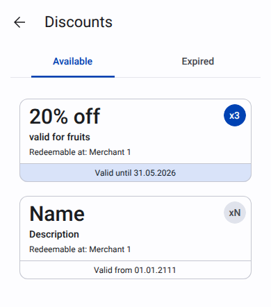
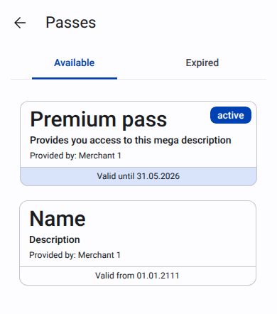
20.94.4.1.1. Available#
|
|
Inside card next information is displayed:
Name of the discount or pass
Description
For discount card: “Redeemable at:” with the merchant name. For pass card: “Provided by:” with the merchant name.
Validity section:
For active items: “Valid until” with the expiration date. Background color is SecondaryContainer. Text color is onSecondaryContainer.
For future items: “Valid from” with the start date.
Badge used to indicate number of items of the same type. If only one item of the same type is owned, the badge is not shown.
For active items: badge background color is Primary. Text color is onPrimary.
For future items: badge background color is SurfaceVariant. Text color is onSurfaceVariant.
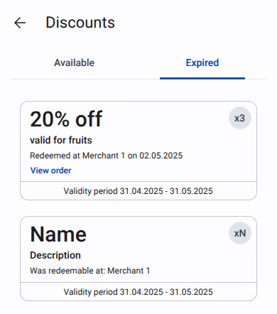
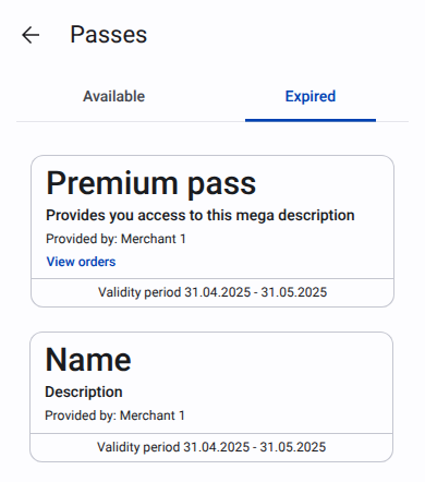
20.94.4.1.2. Expired#
|
|
Inside card next information is displayed:
Name of the discount or pass
Description
For discount card:
Redeemed: “Redeemable at” + merchant name + “on” + redeemed date. Text button with
primary color“View order” with the link to the order details page.Not redeemed: “Was redeemable at:” with the merchant name.
For pass card:
“Provided by:” with the merchant name.
For used pass show text button Primary color “View orders” with the link to the orders list.
Validity section: “Validity period” and date range.
Badge used to indicate number of items of the same type. If only one item of the same type is owned, the badge is not shown.
20.94.4.2. Order details page#
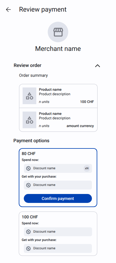
On this page next information is displayed:
Merchant logo
Merchant name
Merchant address
“Review order” section collapsed by default. Linear blur is applied to give a hint to user what is inside this section. When user clicks on “Review order” section, the section expands and blur is removed. In this section next information is displayed:
Order summary
List of products with:
Picture (if available at least for one product)
Name
Description (if present and different from order name)
Quantity with unit name
Price per unit
Total price, calculated as
(product price * quantity)and currency code
“Payment options” section. Chosen option has
primary colorborder, primary button “Confirm payment” andprimaryContainerbackground for list of discounts/passes. For each option next information is displayed:Price
“Spend now:” section with the list of discounts and passes applied to the order.
“Get with your purchase:” section with the list of discounts and passes that will be added to the wallet after the order is completed.
20.94.5. Test Plan#
20.94.6. Definition of Done#
20.94.7. Alternatives#
Instead of blurring the “Review order” section, we could use fade out effect for collapsed section.