20.93. DD 93: Checkout Page#
20.93.1. Summary#
The checkout page may be reached from different places, such as a merchant portal or another service integrating Taler. To avoid inconsistent user experiences, Taler should provide a unified checkout design that looks and behaves the same across all integrations. A consistent checkout page helps users immediately recognize a Taler payment flow, builds trust, and makes payment faster and easier to understand. It also ensures shared handling of states such as payment, claim, and completion across all use cases.
20.93.2. Motivation#
Existing payment page shows only the QR code and a link to open the wallet. This design is not sufficient for all use cases, especially when discounts, subscriptions, or other purchase benefits are involved. In these cases, users need to see more information about the order, such as the summary, amount, and merchant name. This can help users to verify the correctness of QR code and purchase details before payment.
20.93.3. Proposed Solution#
The checkout page should follow one common layout across desktop and mobile, while adapting the content depending on the payment state and available purchase benefits.
PenPot design files for the checkout page are available here.
20.93.3.1. Default payment#
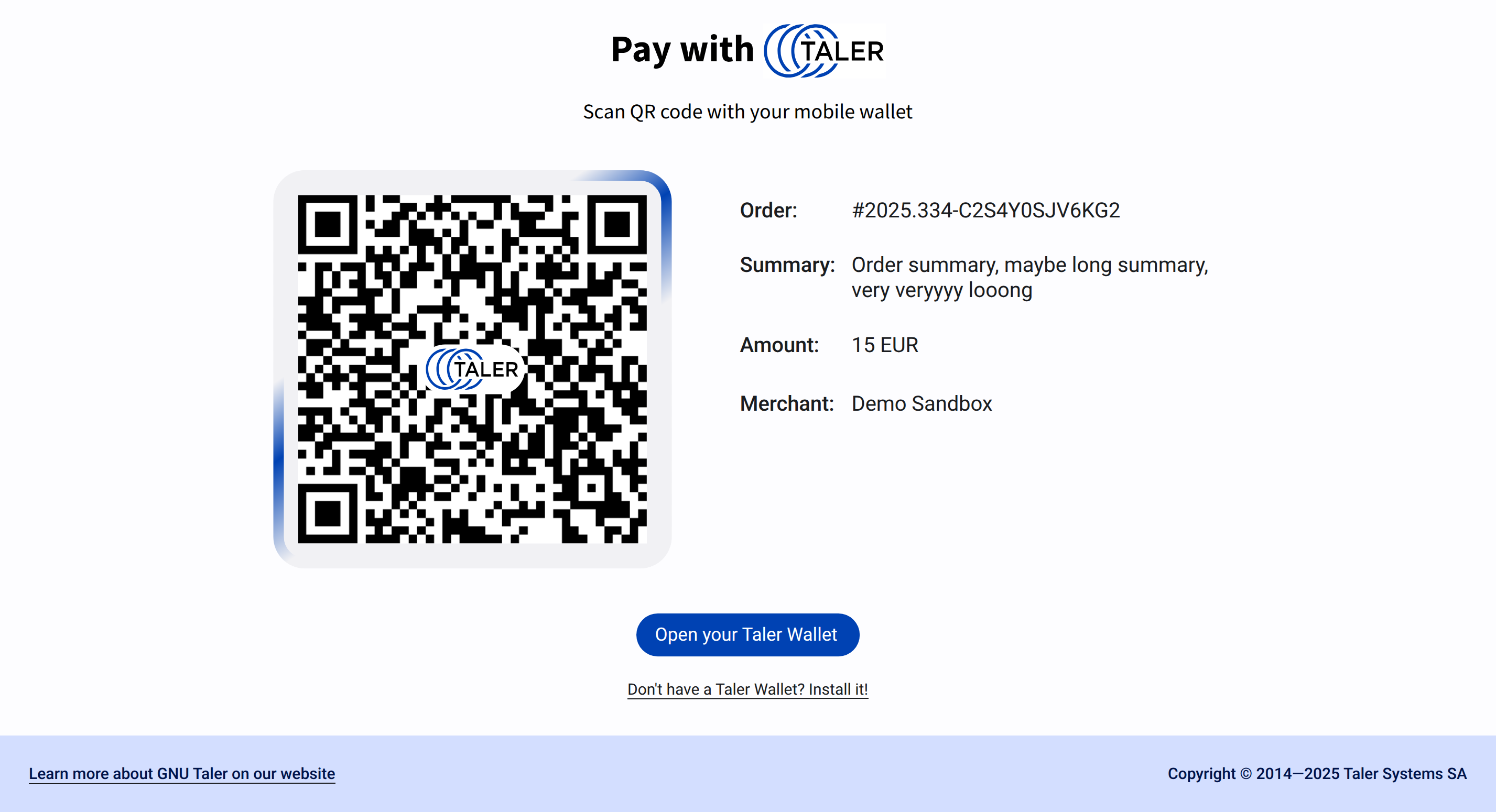
The default state shows the core payment information in a clear two-column layout on desktop and a stacked layout on mobile.
At the top of the page, the user sees the Taler heading and a short instruction to scan the QR code with a mobile wallet. The main content area contains:
the QR code
Payment deadline as “QR code is available far payment until
$date,$timethe main order metadata next to it
the primary action button to open the Taler wallet
a secondary link for users who do not yet have a wallet
a footer with a link to the GNU Taler website and copyright information
The order metadata must always show the order id, summary, amount, and merchant name, if these fields are available.
20.93.3.2. Order with discounts or subscriptions#
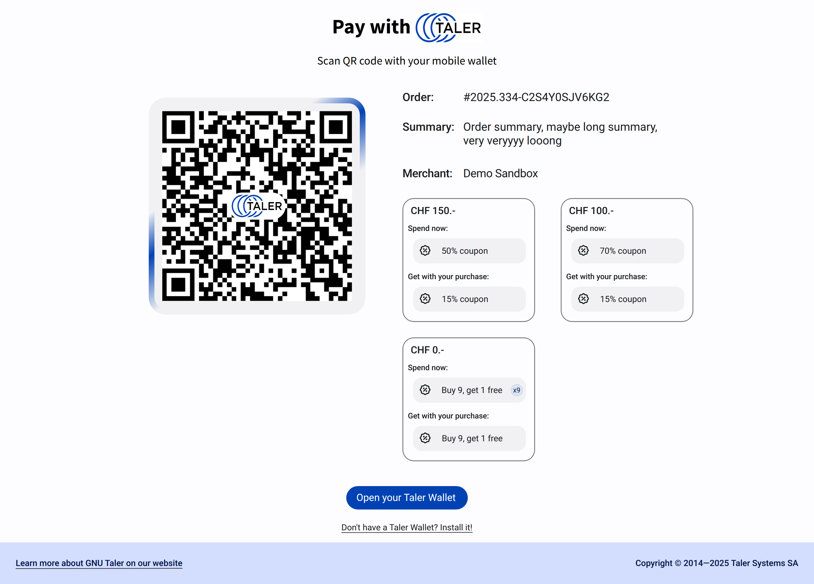
If the purchase includes discounts, subscription, these should be displayed as additional cards in the order details area next to the main payment information. Page should display a maximum of 2 cards in a row on desktop and stack them vertically on mobile. These 2 cards should be the most beneficial options for the user. Under the cards, text “Scan the payment QR code or open payment link in your Wallet to see the full list of payment options.” should be displayed to inform the user that more options are available in the wallet.
Each card should present a benefit in a compact and scannable way. The card may include:
a price condition
coupons or subscriptions to spend/use
the reward granted by the purchase
quantity indicators for repeated or accumulated benefits
These benefit cards must not replace the core payment information. They are supplementary elements and should remain visually secondary to the QR code, order metadata, and wallet action. On smaller screens, the cards should stack vertically below the main payment section.
20.93.3.3. Claimed state / waiting for payment#
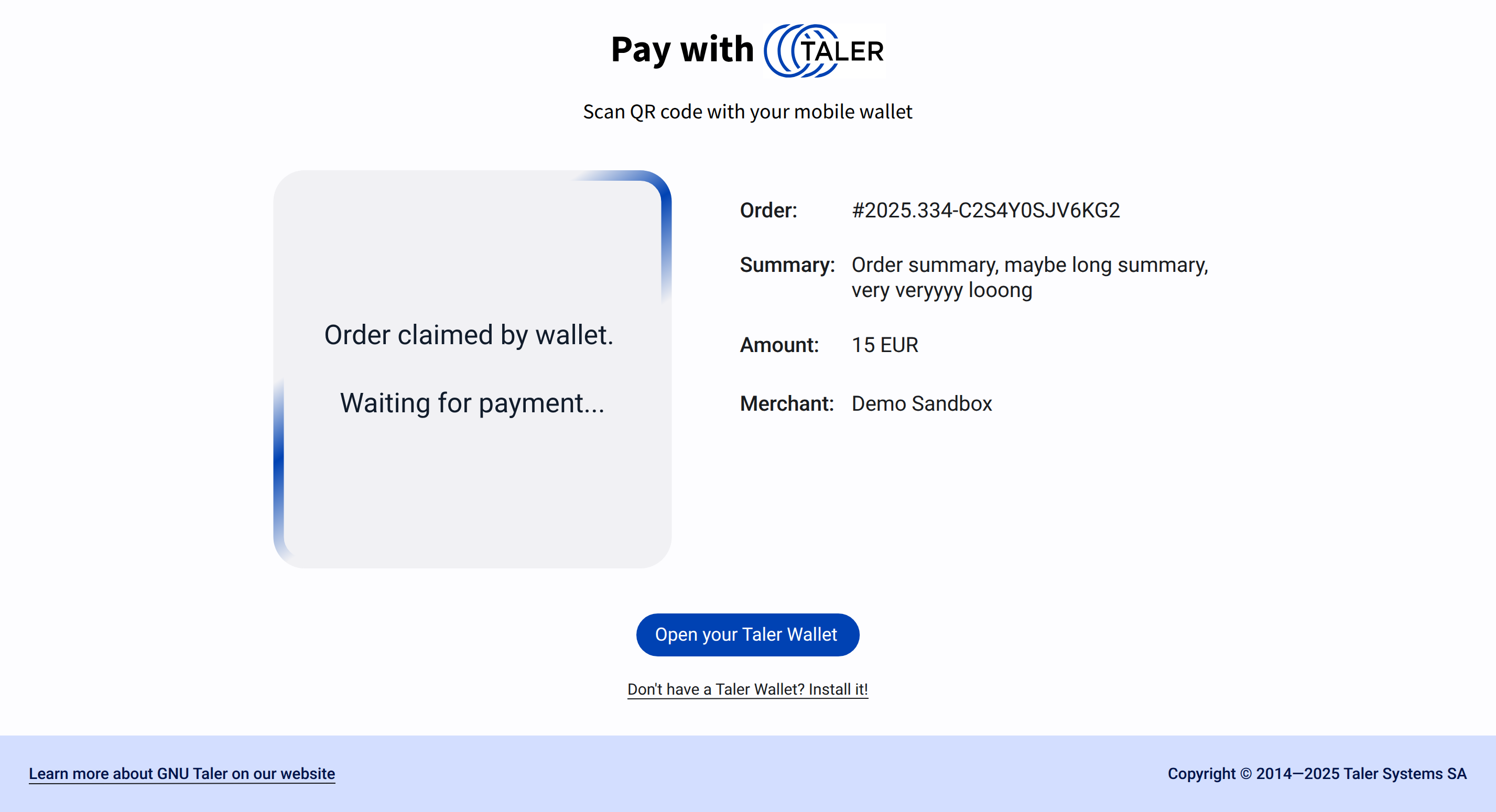
Once the wallet has claimed the order, the QR code should no longer be shown. Instead, the QR code area is replaced by a status panel indicating that the order has been claimed and that the system is waiting for payment confirmation.
This state should keep the same overall page structure and continue showing the order metadata and main wallet action. Replacing the QR code after claim helps avoid confusion, prevents rescanning of an already claimed order, and makes the current payment state immediately visible.
20.93.3.4. Mobile layout#
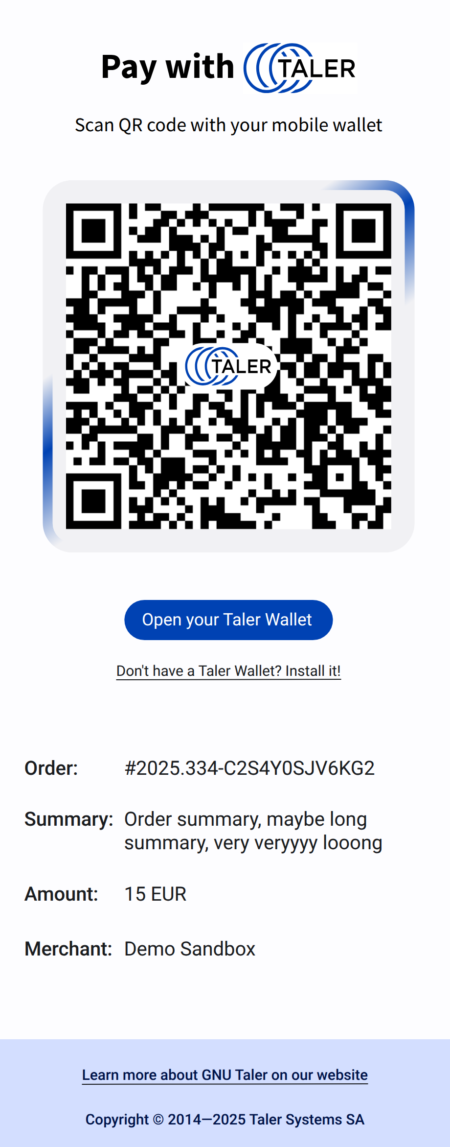
On mobile devices, the same elements must be preserved but arranged in a single-column flow. The order of elements should be:
page heading and instruction
QR code or claimed-state status panel
Payment deadline
wallet action button
wallet installation link
order metadata
discount or subscription cards if available
footer
The QR code container, action button, and order details should use full available width with appropriate spacing for touch interaction and readability.